Over the next few chapters, we are going to build up your skills to produce visualisations of your network data. To keep things as consitent as possible, we are going to use the same dataset as a case study for you to learn from. Seeing the same network visualised different ways can help you focus on the techniques rather than the differences in network structure across groups. So, we will use our Grime musician network from here on. In this section we will cover basic techniques to tidy your visualisation through some manipulations to the layout and design. In subsequent chapters we will build on these skills to produce clean visualisations of these musicians.
Creating a ‘clean’ visualisation is a process of toggling back and forth between various options until you generate one that is free from visual noise and clearly demonstrates the nature of your data. Remember, people don’t usually spend too long looking at a visual. So, whatever you want to portray needs to be captured quickly and easily. Thus, try to find ways to draw attention to the things you want to highlight.
There are aspects of the visualisation that you must remember can help you generate a basic clear visual. These are the layout, colours, sizes, titles and labels. In this chapter we will cover each individually, but remember to combine these techniques to generate your visualisation. In fact, a good activity for you to do is to combine these techniques and see if you can produce a visual that you really like.
LEARNING ELEMENTS - Data Practices
Employing Design Practices. Networks are inherently messier than most other data visualisations. Think about a line graph. There is a lot of empty space in the plot, two axes and a line or two to follow (usually flowing left to right to mirror reading!). Networks, however, have a lot going on with the nodes and edges. It is up to you to reduce the visual ‘noise’ and highlight what matters.
Visual accessibility. One word you must care about: accessibility. If your viewer (stakeholder, boss, students, client etc.) cannot understand your plot, then that is a problem! Avoid commonly occurring colour pairings that colourblind people cannot see such as red and green or blue and yellow. Instead select high-contrasting colours or distinct scales.
Create plots that are easily understood (self-contained) without much need for an explanation. Consider using descriptive titles that help guide the attention and understanding of your viewers.
Below, we read in our data and generate some very basic (and somewhat ugly) visualisations as a base for us to build from. Follow the steps in the code. By now, you are pros at cleaning network data so you should be able to follow what we do here.
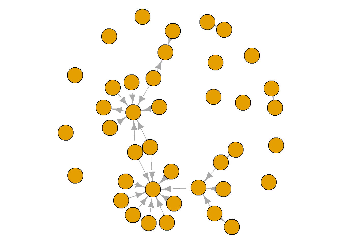
library(igraph)library(ADAPTSNA)grime_edge_list <-load_data("GRIME_2008_Edge.csv", header =TRUE)grime_08 <-graph_from_data_frame(d= grime_edge_list, directed =TRUE)plot(grime_08) # We see selfloops!
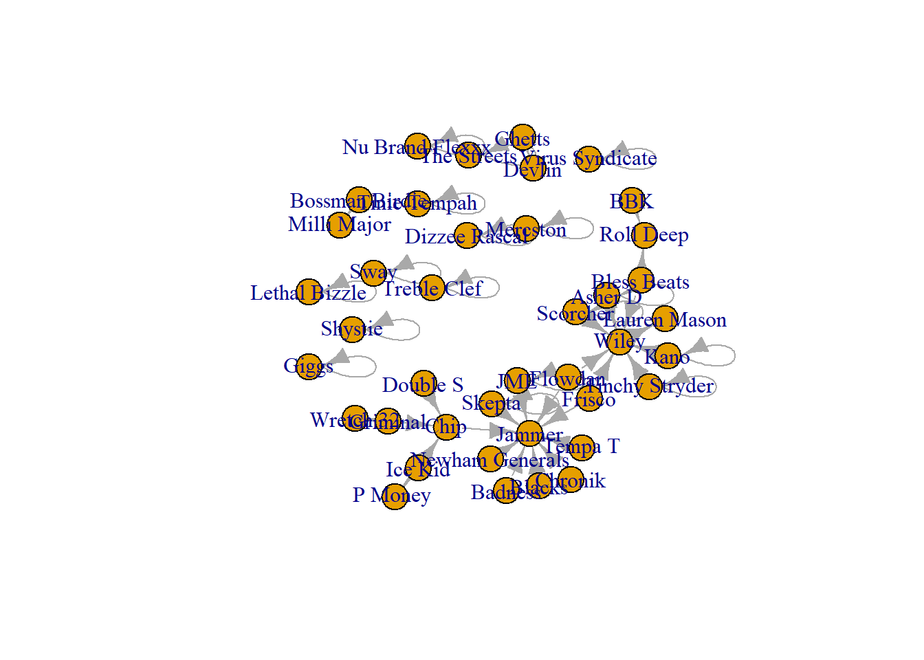
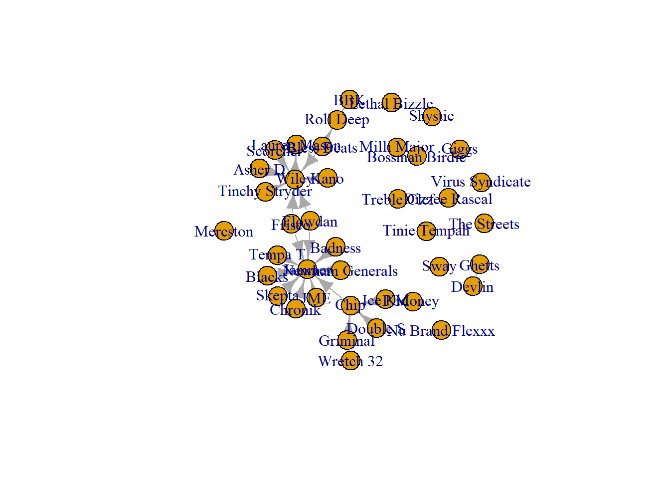
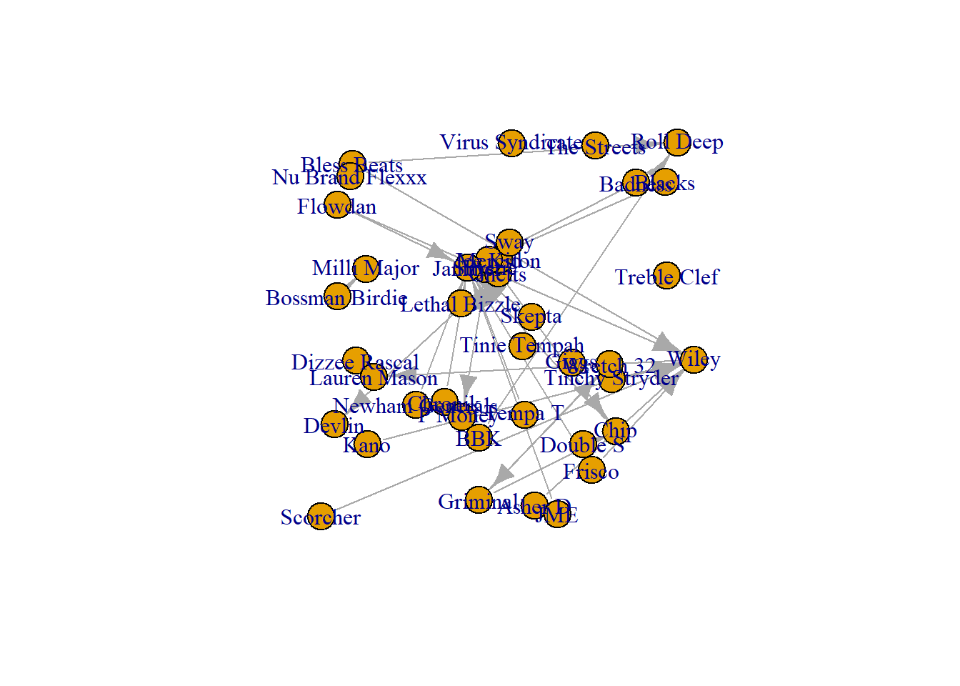
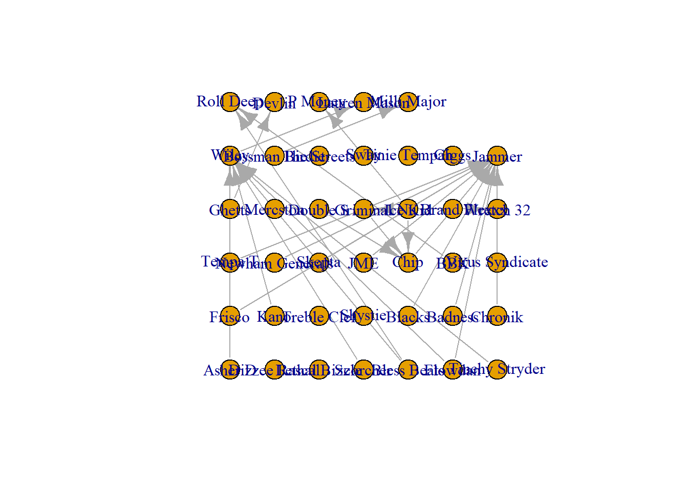
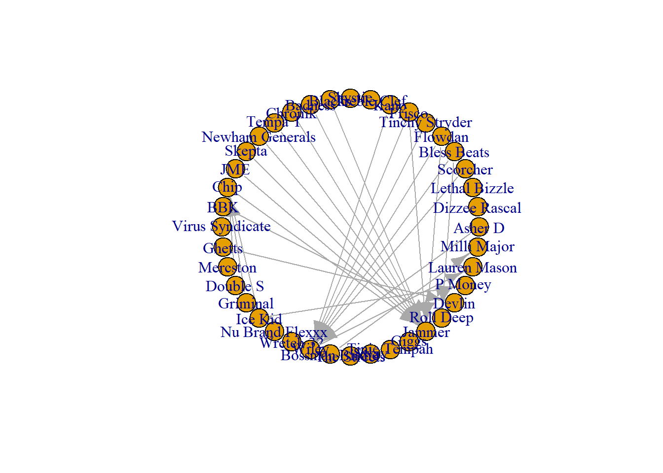
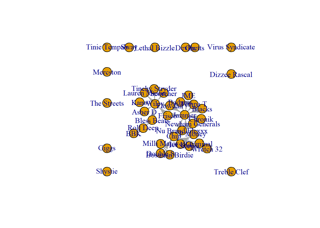
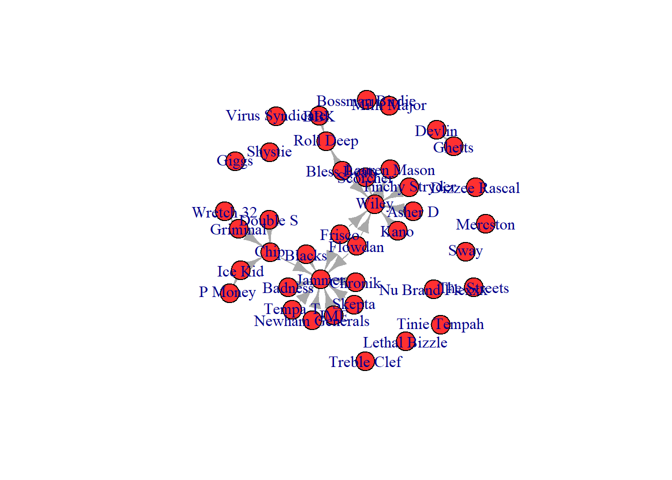
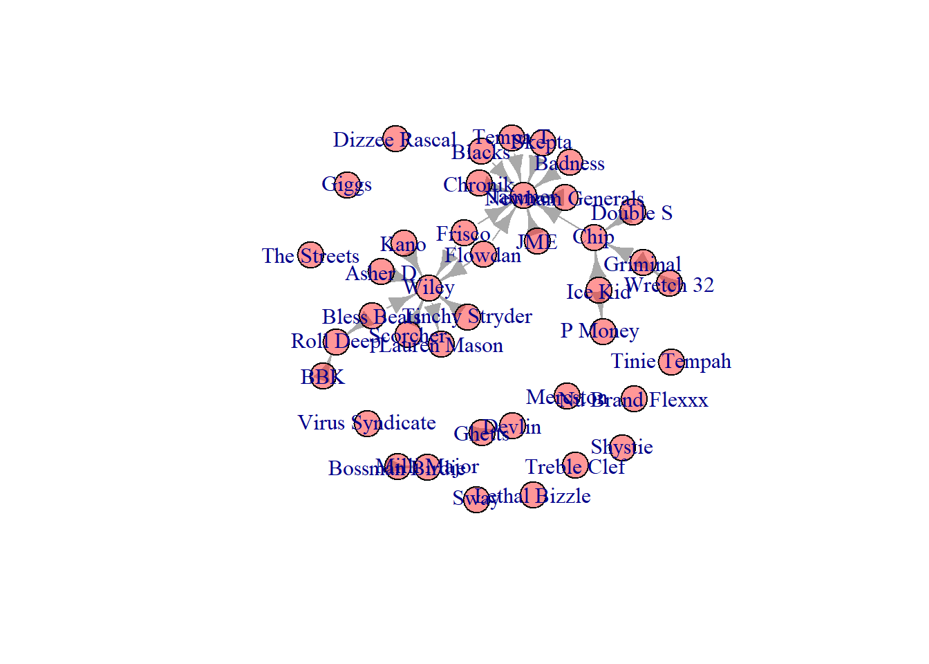
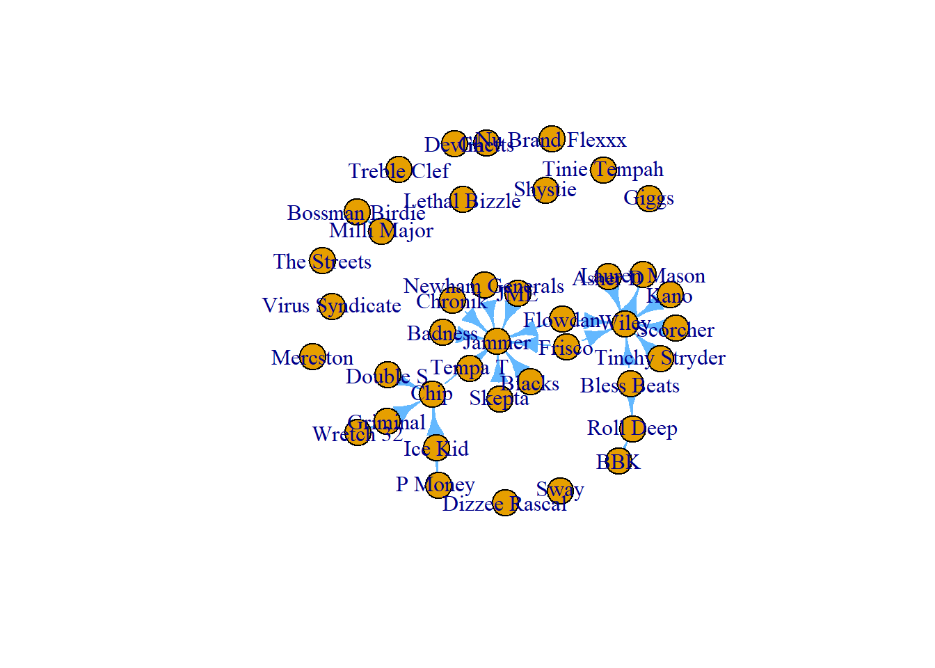
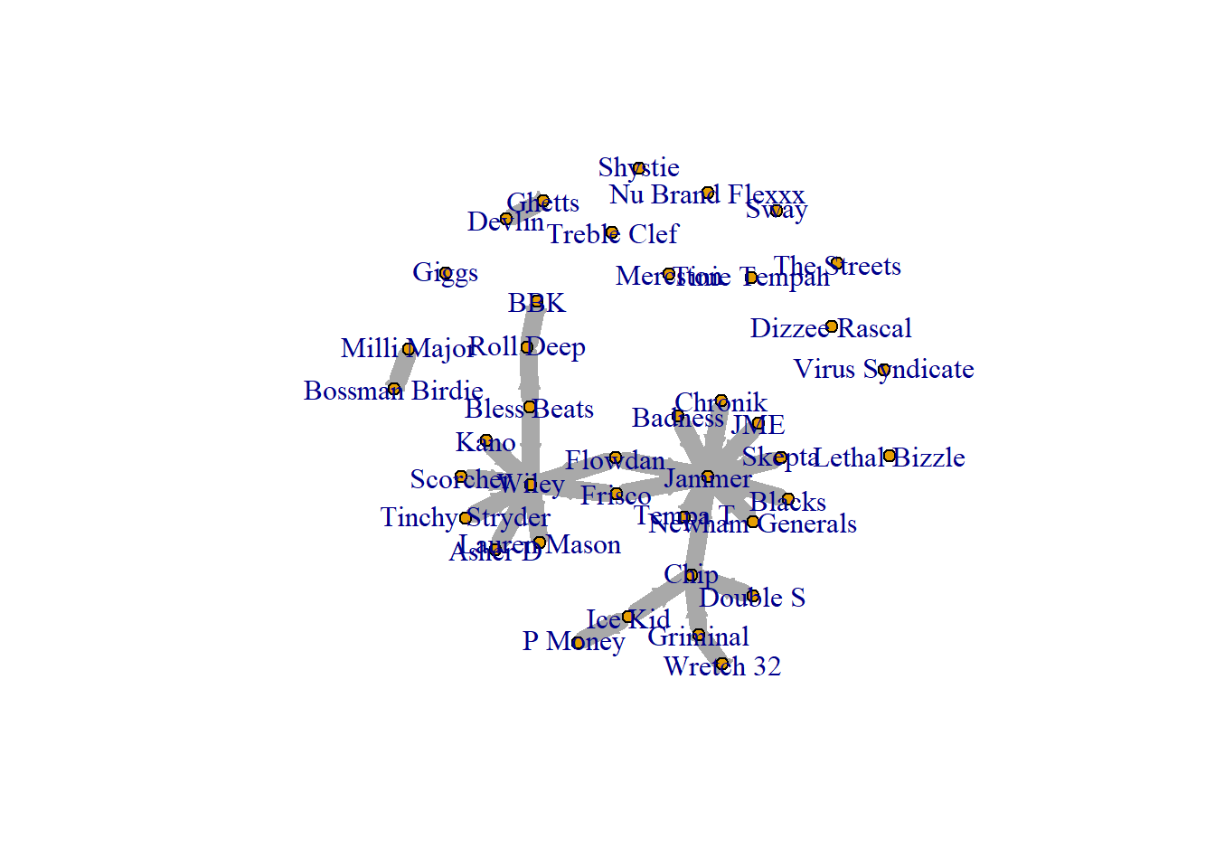
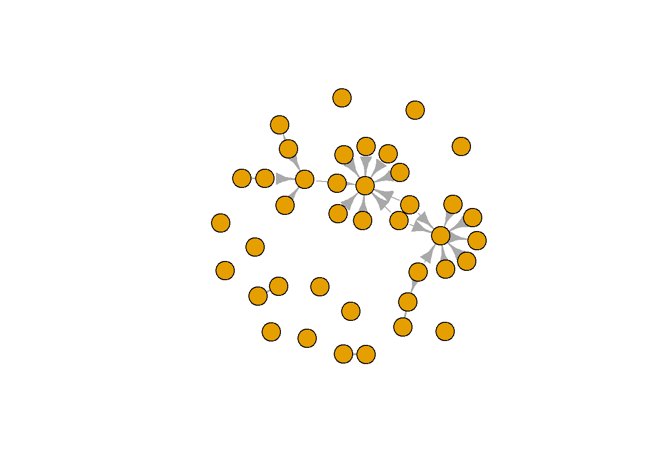
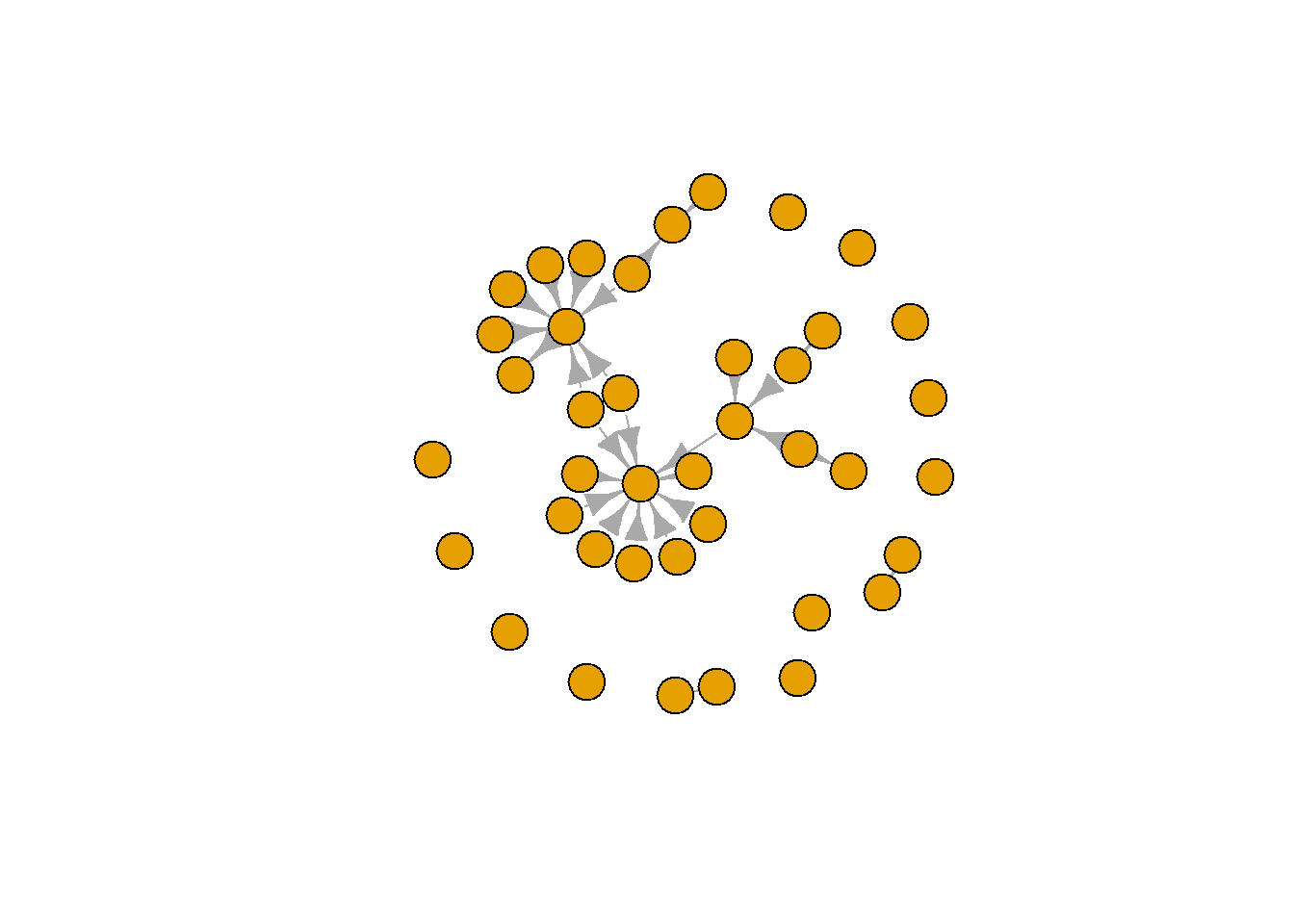
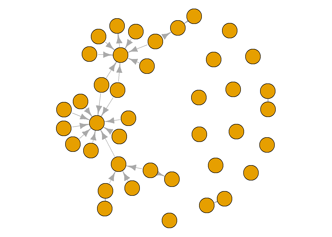
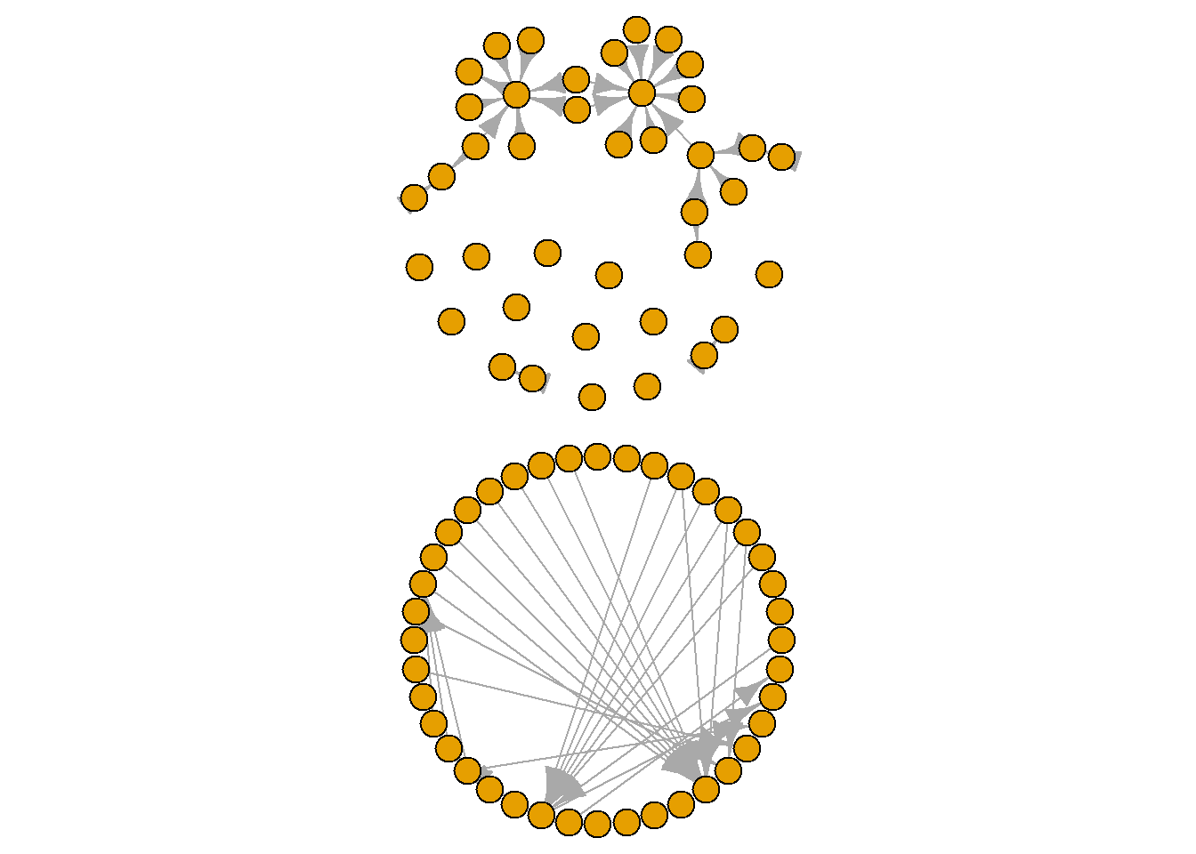
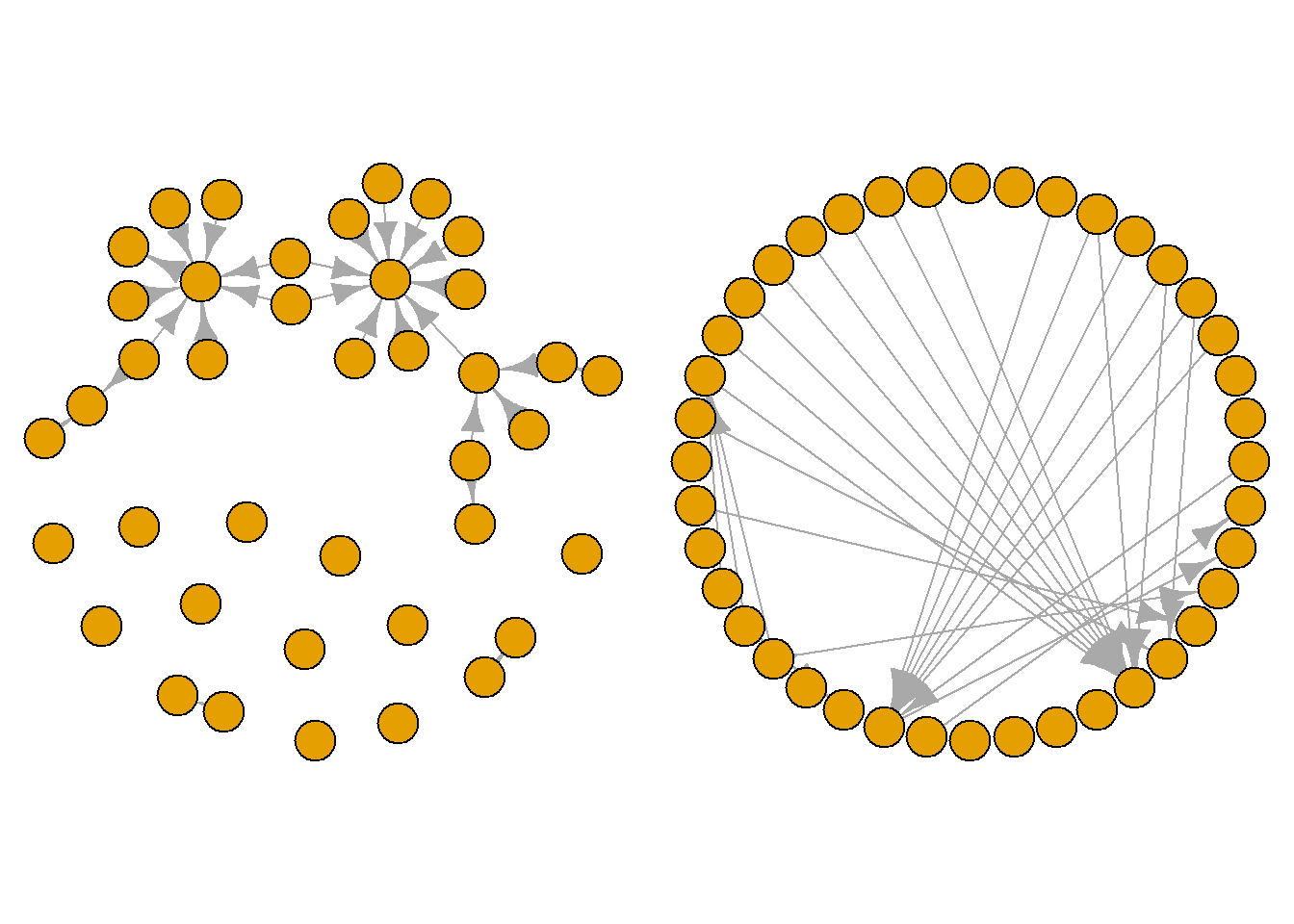
A graph’s layout simply refers to the placement of the nodes and edges. There are multiple preset layouts that igraph can deploy. These preset options simply place the nodes in specific patterns. Such layouts do not change the data in your network, but they produce vastly different visual portrayals of your data.
Some layouts emphasise the nodes in your graph, making them clearer to see, while others emphasise the edges. Take a look through each of these layouts and see the types of stories you could tell about this network with each. Pay attention to the density of the edges in the network and whether there are certain nodes that appear to be more connected than others. The chunks below cycle through three preset layouts. One random, one circular and one grid format. See what you think.
plot(grime_08_clean,
     layout = layout.random)
plot(grime_08_clean,
     layout = layout.grid)
plot(grime_08_clean,
     layout = layout.circle)
These visualisation patterns subtly highlight different things. Notice that the circular layout, for example, draws your attention to the edges in the middle. Meanwhile, the grid draws your eyes to nodes or groups of nodes, obscuring the edges a little. The random layout will place the nodes in random places each time you run it. These may be useful to you to run through a few and see what pops out to you.
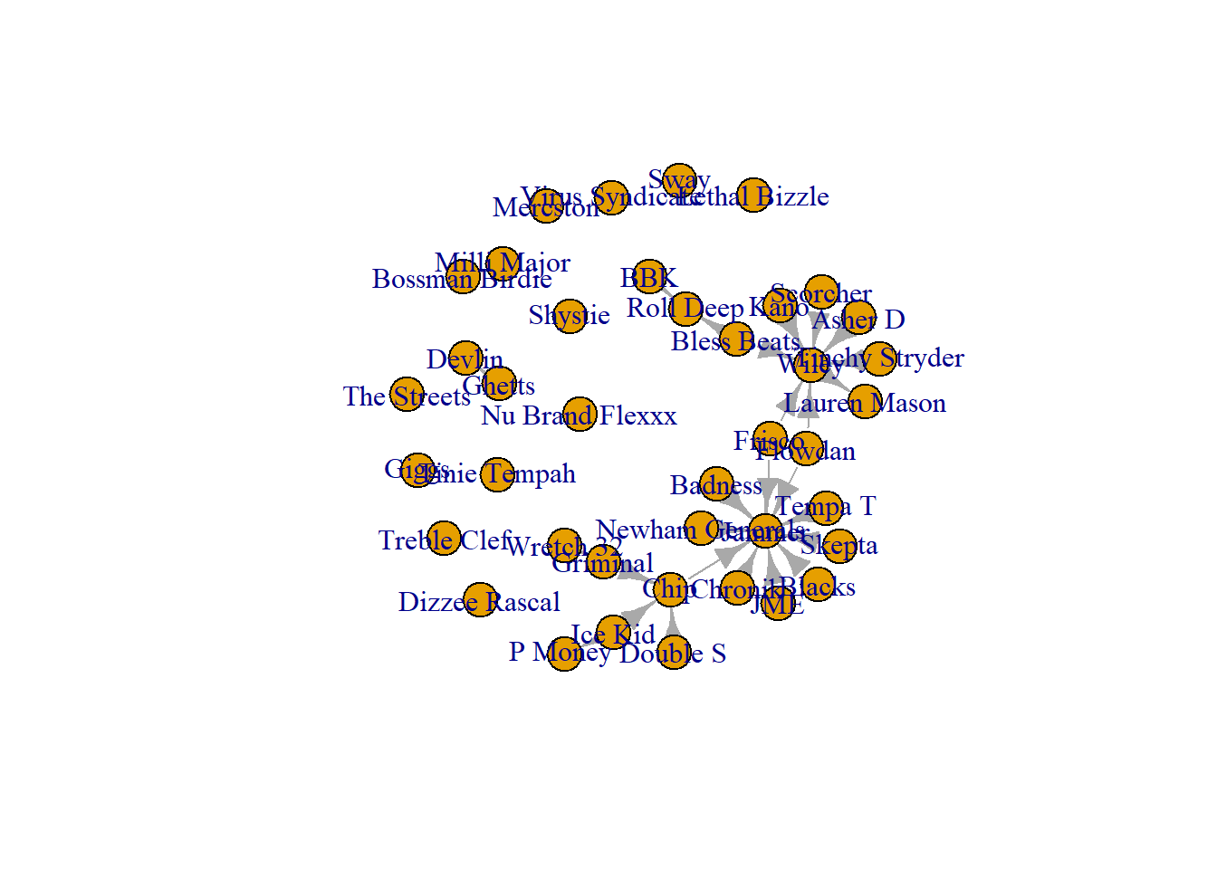
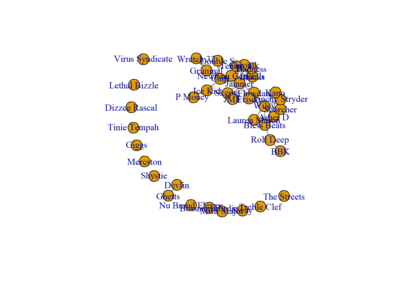
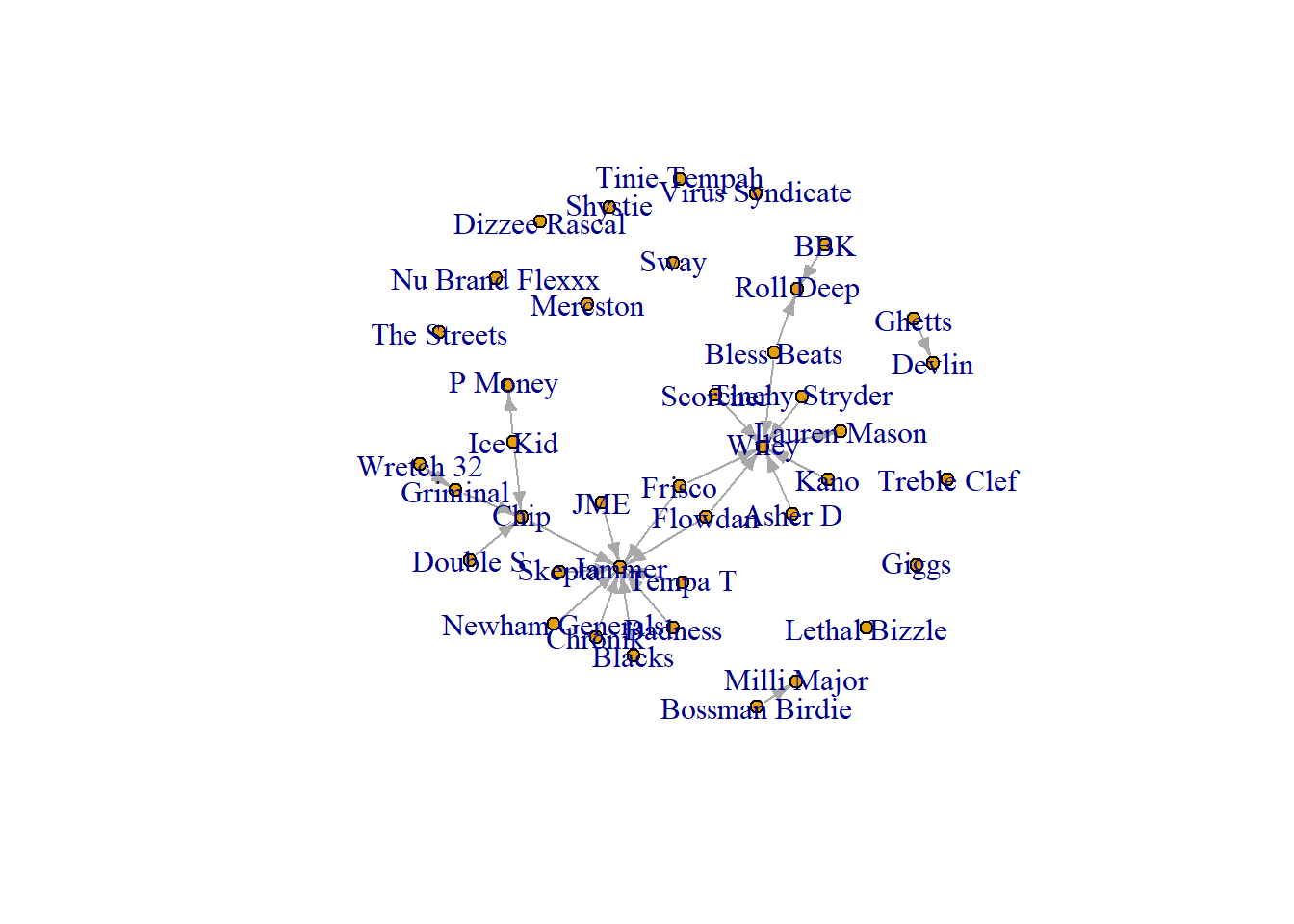
Rather than choosing preset layouts, there are visualisation algorithms that determine a node’s position based on its relationship to others in the network. Such force-directed layouts attract a node towards those that they are connected to but ensures they do not fully overlap. Likewise, they repel nodes that are not connected to each other. Here, we cover three commonly used algorithms: Fruchterman-Reingold, Kamanda-Kawaii, and Davidson-Harl which all perform slightly differently, but, ultimately, achieve the same thing, a visualisation that places nodes based on the similarity of their relationships.
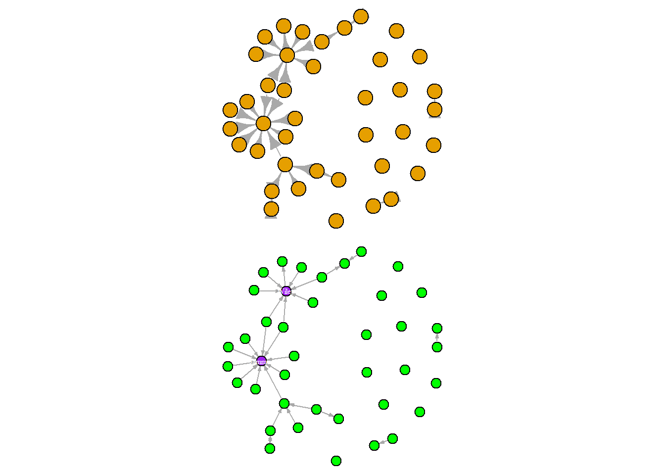
Colours are an important aspect of any visualisation. They can be used to distinguish one type of node from another, they can be used to accent certain nodes, or draw attention towards certain relationships. However, and this is true for any data visualisation you construct, you must remember that not everyone can see colours clearly. So you need to select colours that have a high contrast from one another. Also, avoid colour pairs that many folk can’t differentiate. For example, many can’t see the difference between red and green. So, it is advisable to avoid that pairing.
We can change the node colours with the “verterx.color” option. You can also alter the transparency of the colour using the “adjustcolor” option and changing the colour’s alpha. Adjusting the alpha can also help with visualisations that have many densely connected nodes (hairballs) since the transparency can help visualise overlapping nodes. For these visualisations, we will set the layout to a grid so we can see the nodes clearly.
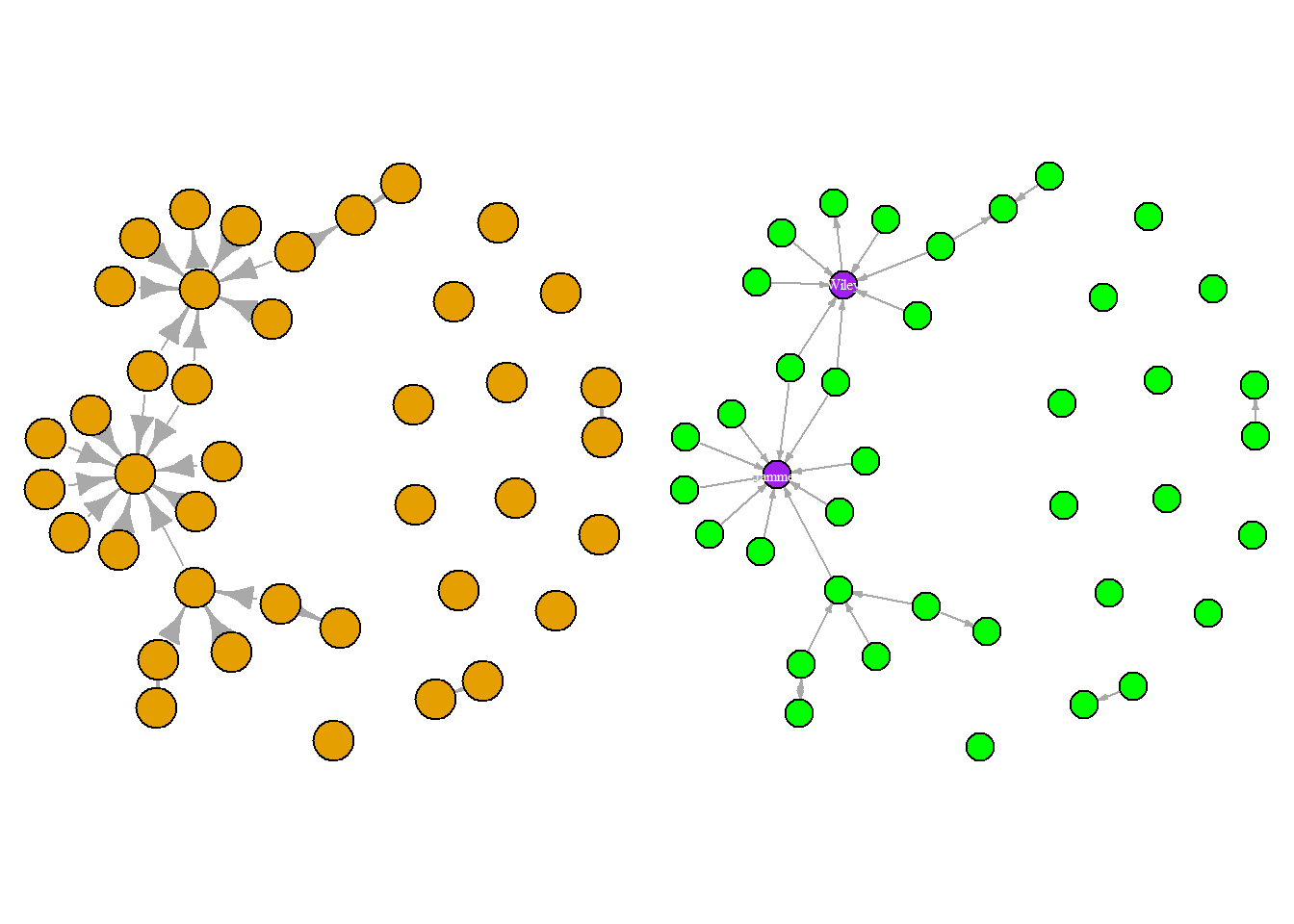
One final element you can chance in your network is the Edge colour. You do that with “edge.color”. We will place the nodes into a ring format to give room to see the edges a little better.
R recognises many of the common names or hex colours. See https://r-charts.com/colors/ for more colours that you can use.
Changing Sizes
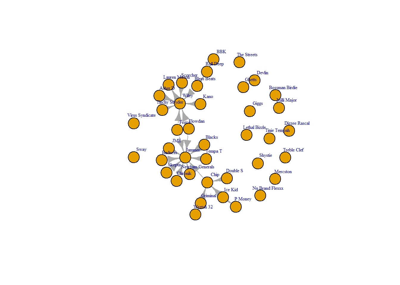
Next, changing the sizes of various aspects of the graph can make it clearer. Keep in mind that bigger does not always mean clearer! If you have a network with a lot of nodes, the chances are that the nodes are overlapping generating what we call a “hairball”. This is less than ideal because hairballs actually hide any of the interesting structure that exists within the network. One way to overcome this is to make the edge and vertex size smaller. Note that you may need to try different sizes to produce a clean visual. Follow the code below.
This helps reveal the ties a little but the labels are still in the way! You can use the “vertex.label.cex” option to play with the sizing and select a size that works a little better with your visual.
Additionally, you can change the width of ties to make them more visible. Previously. we changed the size of the arrows, below we change the width of the lines.
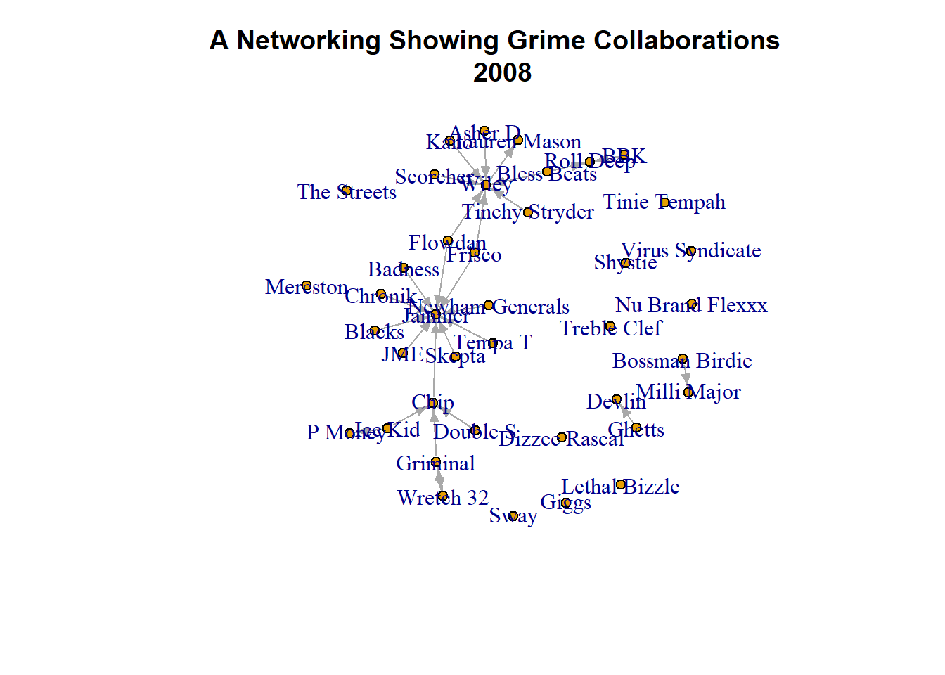
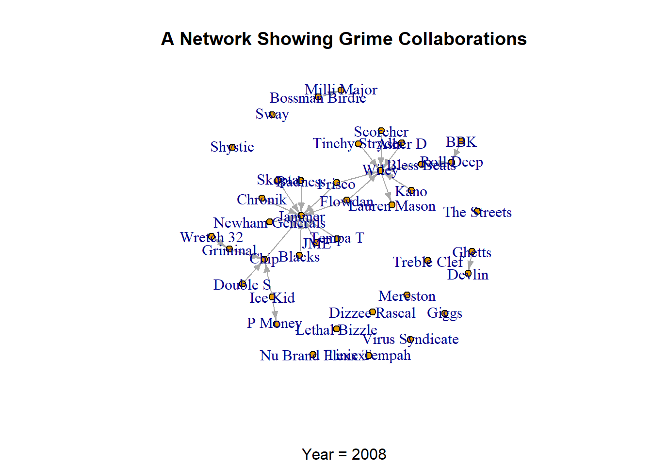
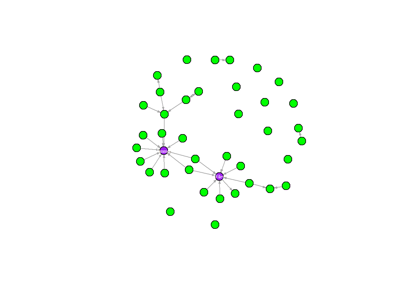
Titles are a great way to further clarify your visualisation by making it it easier to understand. Generally, there are two “styles” of titles. The first is a little more academic that introduces the nature of the visualisation. Something like “A Network Showing the Collaborations of Grime Artists in 2008.” This style simply describes what the graph is. The second style is a more demonstrative of what the graph presents. “Grime 2008 Had Two Well-Connected Artists.” Rather than explaining what the visualisation is (i.e. a network) this style of titles explains what the graph shows (i.e. the story of the vis.). Be mindful of what audiences you are creating visuals for. Are they interested more in explanation or the story?
In igraph, you can have a main title. This is usually at the head or top of the network and orients people to your visual (in either style discussed above).
You may also wish to present a subtitle on your graph. Subtitles act as footnotes or further explanations of your network. These titles are usually placed at the bottom of your of your visualisation.
plot(grime_08_clean, vertex.size =5, edge.arrow.size =0.5,main ="Grime 2008 Had Two Main Collaborators", sub ="Wiley and Jammer")
Labels
Labeling nodes on your network can be useful so viewers can identify individuals easily. Or, you can use them to draw people’s attention to certain nodes.
First, you may wish to change the size or offset the labels from the centre of the node. These options are particularly useful if you have many labels that are running into each other since reducing the size and offsetting them slightly can bring the labels away from highly populated areas of the network increasing its readability.
Alternatively, you may wish to remove the labels altogether. This is useful if you have many nodes and the node labels are running into each other regardless of your sizing and offsetting.
plot(grime_08_clean, vertex.label =NA)
Finally, you may wish to present the labels of certain individuals in the network. To do this, we draw on an “ifelse()” statement and select the person we want labelled.
So far we have talked about changing specific elements of your visualisation to clean it by reducing the visual noise and maximising certain aspects of the graph we care about. However, there are a few other tricks that you can use in R to help producing your visualisations, tidying the plotting window and making your work replicable.
The Aspect Ratio
At the moment, the plots we have created look rather “zoomed out.” Almost as though you are looking at it through the wrong end of binoculars. This is because RStudio has margins on their plot windows. What that means is that there is a standard set amount of white space along the margins (sides, top and bottom) of a plot. We can reduce these margins with the “par()” function and reduce the margins (mar=) to 0. What this effectively does is “zoom in” to the plot by removing the white space. Bare in mind, the “mar” option requires you to state one number for each margin in the plot. This starts at the bottom, then left, top, and then right. So, if you set a “mar = c(5,1,1,3)” you will have a plot that has five units on the bottom, 1 on the left and top, then 3 on the right. You must run the “par()” function prior to your “plot()” for it to take effect. Take a look at the following plots for a demonstration.
The second plot appears a little more “zoomed in” meaning that the white space along the margins have been removed. Keep in mind, if you have titles (main or sub) or a key/legend on your plot, you will need to increase the margins accordingly since these are placed into the margins.
Replicating Plots
You might have noticed that each time we plot our grime network, it looks a little different. This is true even when you run the same code more than once. The nodes and edges are all the same, but the position of the visualisation is different each time. This occurs because R begins a plot from a point (sort of like coordinates) in the plot window and selects a different place each time. In order to produce the same plot more than once, you must set the seed which basically means telling R where to start. If it starts in the same place each time, it will produce the same visual. Take a look at the following code.
par(mar =c(0,0,0,0))set.seed(123) # tell R where to start plottingplot(grime_08_clean, vertex.label =NA)
In the above chunk we have set the parameters (zoomed in) and selected a whats called a “seed” (the starting point) of 123. This could be whatever numbers you want. So long as you call on it the same each time you plot that network, it will produce the same visual. This is particularly important if you have found a specific way to visualise your network and need to replicate that for further edits or collaborators. As such, it is always a good idea to set a seed unless your are using a preset layout. See below, for example.
par(mar =c(0,0,0,0))set.seed(123) # Same as beforeplot(grime_08_clean, vertex.label =NA)
Multiple Plots
One final trick for you! You may want to have more than one plot next to each other. This side-by-side approach is often useful to compare across visualisations or to present different elements of the network. Again, we use the “par()” function, but this time we use the “mfrow” option and then set the number of rows and columns in our plot window.
Here we set our plot to have two rows and one column which presents one visual stacked on the other.
Notice the language that I use in this chapter for you. I talk about visualisation using terms like “build” and “construct.” This is on purpose. I strongly encourage you to think about this step of your workflow (whether for personal exploration or communication) as building a visual. As such, you should focus on creating a coherent aesthetic to your network that emphasises what story you are telling. Visualisation is a powerful tool to communicate data. However, visualisations can be very messy and the mess may confuse rather than clarify.
In this section, we have covered:
Methods for reducing visual noise in a network through changing the layout, sizes, and colours
Effective titling
Effective and accessible colouring of network visualisations
Ways to make certain aspects of the network more prominent
General tricks for creating network visuals in RStudio.