library(igraph)
library(tidyverse)
library(ADAPTSNA)9 Node and Edge Characteristics
So far, we have been dealing with network data by only looking at the relational aspect of it. However, the people in the network have some characteristics that define them as do the relationships that exist betwen people. In this chapter, we will cover how to create a network object that has more than just the relationships but enables more complex forms of analysis.
Think about the relationships you have with people. There are certain words you may use to describe them that take on a character of their own. You may consider some relationships to be close and positive. Others, you may consider as distant or even negative. What this means, in terms of data, is that a network might have information regarding the connections between nodes. These could be things that denote a certain type of connection between individuals in the network (romantic vs. friend, positive vs. negative, kinship vs. neighbour vs. colleague). These, qualitatively different categories, tell us more about the types of relationships that there are between the nodes in our network. There is, of course, the possibility that two people may have multiple ties (friends and romantic partner, for example). This is called multiplexy. While multiplex relationships are fairly common, we will just focus on unique relationship categories to keep things a little more straight forward. In addition to this, quantitative information can also tells us additional things about the relationships. Such data could include things like frequency of communication (called edge weights) indicating that there are substantively meaningful differences between the levels of connection (for example interacting only once compared to 10 times).
Beyond just information about the relationships, your network may have some information about the nodes. This could include categorical information (e.g personal traits or characteristics like sex or race) or numeric information (e.g. age). These kinds of characteristics might influence the analysis we want to run. For example, we might want to see the average ages of the most popular people in the group. Alternatively, we may want to see whether being male vs. female means you are more or less likely to hold central positions in some networks compared to others.
All of this data, then, is vital to network analysis. To wrangle it, we much attach it to the network object we create. Like working with any data, there are many ways to do this like adding characteristics to the graph object itself. However, it is more common that you pull information about individuals from a data source. So, we will focus on that approach.
| LEARNING ELEMENTS - Data Perspectives and Practices |
|---|
|
To learn a little more about wrangling node and edge characteristics, we are going to use some fake data. Assume we have collected some data by administering a survey and part of this survey asks folk about their relationships with others. We will have some basic information about them (the respondents) and their relationships to others in our observation group. This is a very useful exercise because we can cover some standard transformations that you regularly use when working with tabular data.
Converting Survey Data to Network Data
For the sake of this exercise, let’s say we surveyed a department wanting to understand how people are getting along and how much they interact with each other. We asked them questions about themselves and then a question like “Name three people you collaborate with each week.” Finally, about those people, we asked, “Would you consider that a positive or a negative working relationship?” and “How many times a week would you say that you work together?”
We need to start by reading in the data and taking a look at it to get familiar with its structure. In the chunk below, we are going to read in the data, and then take a look at the table using the “head()” function.
survey <- load_data("Fake Survey.csv")

head(survey)
name age role gender person_1 person_2 person_3 affinity_1 affinity_2
1 A 20 manage F B C D pos neg
2 B 25 asiss M C E F pos pos
3 C 21 tech F F A D pos pos
4 D 23 tech M G A C neg neg
5 E 24 clerk M A B G neg neg
6 F 23 assis F D G A pos pos
affinity_3 freq_1 freq_2 freq_3
1 neg 2 4 5
2 pos 4 3 2
3 pos 1 3 5
4 pos 5 5 2
5 neg 4 2 2
6 pos 3 1 1In this data table we have rows that represent cases or observations. Each is a person’s responses to our (pretend) survey. We have the names of the individual respondents (A-G) as well as some basic information about them (their age, role in the company and their gender). Then, we can see the series of relational questions that we asked. From this dataset, we can pull out our network with node and edge attributes. This is going to take several steps of wrangling till we get to that stage, however.
We want to end up with two dataframes. First, we want the node characteristics. We will start there since that is the simplest transformation. After that, the second is an edgelist that includes all of the connections (the people each person listed) and the attributes of those relationships.
To do this, you must think about the unit of your analysis and the nature of your data. Since node characteristics describe the respondent, all of those characteristics need to be separate from everything else. In the chunk below, we use the “select()” function to keep the variables we want. In this instance, we are creating an object called “nodes” that has the respondents’ name, age, role and gender.
nodes <- survey %>%
  select(name, age, role, gender)
To construct our edgelist, we need to isolate the individuals that people have nominated. To do this, we need to end up with rows reflecting relationships rather than people. We can accomplish this by converting the table from this wide format, into a long format. This is a handy tool for working with all sorts or data! A simple way to think of this transformation is that wide data have multiple versions of the same variable in each column while a long format has one column per variable. In our case, we want one column with the respondent’s name and another column with their nominated connections. Information about those relationships also need to be on the same row.
The first move is to identify all the information needed. We need the respondent’s name, the people they nominate and then the affinity of that relationship and the frequency of contact. These will each have a separate now.
In the chunk below, we start with the survey data that we have but select only the relational data we want for the edgelist. Then, using the “pivot_longer()” function we construct a a data frame converting the person, affinity and frequency variables from repeated columns one column with multiple rows per observation. Note that we set the “cols = -name” which pivots everything but the respondents’ names. Now, we have three rows per person that reflect relationships that they reflected on the survey. Our edgelist is ready to go!
  edges <- survey %>%
    select(name, person_1:freq_3) %>%
    pivot_longer(
      cols = -name,
      names_to = c(".value", "id"),
      names_pattern = "(person|affinity|freq)_(\\d+)"
    ) %>%
      select(name, person, affinity, freq)
Great work!! From here, we can create a network.
Till this point, we have been creating networks from the relational information using igraph. This comes from just one dataset - either an edgelist or an adjacency matrix. Here, though, we have two datasets that we have created based on our information. One, an edge-level dataset that houses all the relational information (the edges and characteristics of those edges). And one with the node-level information that houses information about the people themselves. Here, then, we create one network using both bits of information combining them into a network that recognises the information about both the people and their relationships to one another. Think of the edgelist as being E and the node characteristics as being called V (which is short for vertex - another word for node). This will come in handy in just a moment.
To do this, we turn to our trusty function “graph_from_data_frame()” and we tell R to pull the relational information from our edges dataset and the node information from our nodes dataset.
survey_g <- graph_from_data_frame(edges, vertices = nodes, directed = T)Now, lets produce a visualisation.
plot(survey_g)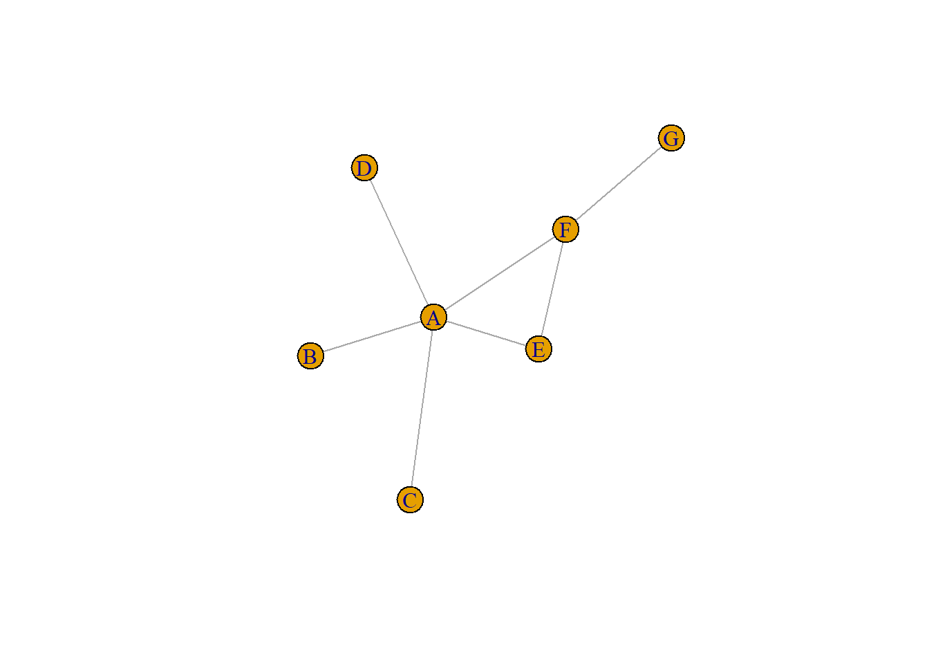
From this survey, we can visualise the relationships between these workers. The spoked wheel-like structure of the network suggests that person A is very central to this network and B - G are connected to one another along the rim with some connections through person A. This visual, while nifty, is not as helpful as it could be. For it to be of greater use, we need to explore these characteristics further.
Exploring Node and Edge Characteristics
We have constructed a network from a survey. Pretty cool! This network is unlike others we have worked with so far so let’s spend some time getting to know it and becoming familiar with how the information about the people and their relationships are stored in this network object. First, below we pull up a summary of the network and work our way through what it all means.
survey_gIGRAPH 67c6272 DN-- 7 21 --
+ attr: name (v/c), age (v/n), role (v/c), gender (v/c), affinity
| (e/c), freq (e/n)
+ edges from 67c6272 (vertex names):
[1] A->B A->C A->D B->C B->E B->F C->F C->A C->D D->G D->A D->C E->A E->B E->G
[16] F->D F->G F->A G->A G->E G->CSimilar to other networks we have worked with, this tells us that our network is an igraph object with the unique identification number. The DN shows that this is a directed network with 7 nodes and 21 edges between them. Then, the second line we have a lot of information to pick through. Remember, think about node information as V() and edge information as E(), this is the first place this becomes handy.
The attr: line tells us all the characteristics that we have about these individuals and their relationships. The names of each of the attributes are pulled directly from our nodes/edges datasets respectively. If you rename age to AGE it would change here when you reconstruct the network.
This network has six attributes. You may notice that they are split into two groups, the Vs and the Es. Inside the parentheses we have a V or an E followed by another letter. The second letter denotes the unit of measurement of that characteristic. For example, the attribute called “name” has a ‘v’ and a ‘c’ in parentheses. The ‘c’ stands for character. Meanwhile the ‘n’ in age stands for numerical. You may, in the future, come across other letters like an ‘l’ which stands for logic. All you need to focus on is that this tells you the nature of that attribute. Is is a word? Then it is likely stored as a character. Is it a number? Then it is numerical. And so on.
Now we understand the differences across the attributes, we can access each and take a look using “vertex_attr()”. The basic recipe for this is to state the name of the network first then, after a comma, state the attribute you are trying to view. This will return a vector with your node information in order of their appearance in the network.
vertex_attr(survey_g, "age")[1] 20 25 21 23 24 23 22Likewise, we can access and examine the edge attributes using the “edge_attr()” function. The recipe for this function mirrors the one above.
edge_attr(survey_g, "affinity") [1] "pos" "neg" "neg" "pos" "pos" "pos" "pos" "pos" "pos" "neg" "neg" "pos"
[13] "neg" "neg" "neg" "pos" "pos" "pos" "neg" "pos" "neg"Alternatively, you can use a shorthand version of code to acheive the same result using the “V()” or “E()” functions. See below.
V(survey_g)$age[1] 20 25 21 23 24 23 22E(survey_g)$affinity [1] "pos" "neg" "neg" "pos" "pos" "pos" "pos" "pos" "pos" "neg" "neg" "pos"
[13] "neg" "neg" "neg" "pos" "pos" "pos" "neg" "pos" "neg"With these, we can influence the way that we visualise the network. Based on what we have covered so far about these attributes, follow the logic of the code below to determine how we are constructing the visualisation.
plot(survey_g, vertex.label = V(survey_g)$role, edge.color = ifelse(E(survey_g)$affinity == "pos", "green", "purple"))
Setting these edge and vertex attributes like this, we can now tell a lot more about this network. The central figure (person A) is in management. This makes sense that they are the hub of this wheel. Meanwhile technicians, assistants, and clerks are on the outside. Meanwhile, the distribution of positive (green) and negative (purple) show us even more about this group. The negative relationships largely come from or are directed to the management.
Remembering that these are fabricated data, we have begun to tell stories using these characteristics. Visualising node and edge attributes are a very clean method to provide more information about a group than is available from a standard network visualisation. We will cover more on telling stories using visualisations later.
Converting Networks To Dataframes
One other data transformation that pertains to our work here on attributes is the ability to extract dataframes from networks. The simplest use-case is to convert your network object back into an edgelist or an adjacency matrix. This comes in handy in converting your network data from one format to another. A simple flow may be from an edgelist to a network, then from a network to an adjacency matrix. It serves as a handy way to swap your data from one format to another.
survey_matrix <-  as_adjacency_matrix(survey_g, attr = "freq", sparse = TRUE)

as.data.frame(as.matrix(survey_matrix))
A B C D E F G
A 0 2 4 5 0 0 0
B 0 0 4 0 3 2 0
C 3 0 0 5 0 1 0
D 5 0 2 0 0 0 5
E 4 2 0 0 0 0 2
F 1 0 0 3 0 0 1
G 1 0 4 0 1 0 0A second use-case for this may be to pull out node and vertex information to form a data table that you may need for further analysis. Let’s say you are working on a project and have been given a network object that has some attributes attached. You may wish to tabulate these data and, maybe, merge them with further information. We can do this by utilising the extraction methods we covered above. See if you can follow the flow of the chunk below where we construct a data frame that captures the node information from our network.
nodes2 <- data.frame(
  name = V(survey_g)$name,
  age = V(survey_g)$age,
  role = V(survey_g)$role,
  gender = V(survey_g)$gender
)
Now, we can do the same with our edge information. Here, however, we need to be a little more careful. We blend some functions from the tidyverse and igraph here. So, let’s pick through this piece by piece. First, we are creating an object we call “edges2” and fill it with the edge information that we take from the the igraph object. We use the “as_data_frame()” function from igraph. However, since we have used the tidyverse in this chapter, and that has a similarly worded function, we need to specify that this is the igraph version. This is accomplished as we add “igraph::” which tells R to use this version, no others. This allows us to directly transfer the network object into a dataframe. Second, to replicate the naming orders we have in our original data set (not necessary, but just to demonstrate the following) we use the “rename()” function from the dplyr package which is part of the tidyverse that we draw from here. In this, we construct a full replica of our edge dataset.
edges2 <- igraph::as_data_frame(survey_g, what = "edges") %>%
  dplyr::rename(name = from, person = to)
Now we have “nodes2” and “edges” 2 you could join them first by pivoting the edgelist to wide again and then merging it with the node characteristics and you would end up with the same survey information. Follow along below.
# Pivot the edges back to wide format
edges_wide <- edges2 %>%
  group_by(name) %>%
  mutate(id = dplyr::row_number()) %>%
  pivot_wider(
    names_from = id,
    values_from = c(person, affinity, freq),
    names_sep = "_"
  ) %>%
  ungroup()

## Now merge the two objects together by the respondent's name
survey2 <- merge(nodes2, edges_wide, by = "name")

head(survey2)
name age role gender person_1 person_2 person_3 affinity_1 affinity_2
1 A 20 manage F B C D pos neg
2 B 25 asiss M C E F pos pos
3 C 21 tech F F A D pos pos
4 D 23 tech M G A C neg neg
5 E 24 clerk M A B G neg neg
6 F 23 assis F D G A pos pos
affinity_3 freq_1 freq_2 freq_3
1 neg 2 4 5
2 pos 4 3 2
3 pos 1 3 5
4 pos 5 5 2
5 neg 4 2 2
6 pos 3 1 1Summary
What a journey!! Well done. You have done some data gymnastics in this chapter and have really mastered some of the intricacies of working with node and edge characteristics. Remember, these are not just relationships that we are analysing/visualising but there are so many things that characterise the nodes and the relationships between them. We can bring those in and use them in our network analysis. We will work more with these skills later on and build some more effective visualisations using these characteristics.
For now, we have covered:
- How to derive node and edge characteristics from survey data
- Creating a network object with both node and edge attributes
- Understanding how these are stored in and extracted from the network object
- How to convert a network object into data frames.