library(ggplot2)
library(plotly)
library(dplyr)
library(gganimate)6 Beyond Static Visualisation
6.1 Interactive Plots
So far, we have generated static and dynamic plots which make for some nice visualisations. However, we may wish to make some interactive visualisations. Interaction can be a useful tool in visualisation because it gets people involved with the data directly. There are many packages that can do this. The most basic serves as an extension of ggplot2, is pltoly. Let’s return to our paired down coffee scatter plot and make this interactive.
coffee <- read.csv(file.choose())

coffee_small <- coffee %>%
  filter(Location.Country == c("Mexico", "Colombia")) %>%
  select(Location.Country, Year, Data.Scores.Aroma, Data.Scores.Flavor)
No we can recreate the plot we generated showing the relationship between aroma and flavour across two countries - Mexico and Colombia. To make a plot interactive, simply setup your ggplot2 syntax, store it as an object, then plot using ggplotly(). Now, hover over each point and you will see that each observation has a label indicating the scores and which location the are from. At the top of the plot window there are some other options like zooming in and out, panning around, or highlighting a section of the plot.
coff <- ggplot(coffee_small, aes(x = Data.Scores.Aroma, y = Data.Scores.Flavor, colour = Location.Country)) +
  geom_point()
ggplotly(coff)
Desnity plots……………
cof_dens <- ggplot(coffee_small, aes(x = Data.Scores.Flavor, colour = Location.Country, fill = Location.Country)) +
geom_density(alpha = 0.25)

ggplotly(cof_dens)
This provides an interactive way for your constituents to engage with your data. Let’s look at some other examples and explore their uses. The syntax and logic is the same for boxplots. I think these are among the most useful when interactive. Comparing two groups side-by-side is not always very easy to do without a ruler to see where each element of the distribution fits along the y-axis. However, when I however over the boxes, I can see the numeric values and easily compare those across groups.
cof_box <- ggplot(coffee_small, aes(x = Location.Country, y = Data.Scores.Flavor, color = Location.Country)) +
geom_boxplot()

ggplotly(cof_box)
6.2 Dynamic Plots
You may need to make some dynamic plots that move with time or another category. This vignette is designed to spark some of your imagination on a few different types of plots. First, we are going to use the ‘gganimate’ package which is an extension of ggplot designed to create dynamic plots.
The package gganimate will work with most plots. I encourage you to think about the uses of having dynamic plots. Some plots make more sense than others to make dynamic. For now, though, let’s take a look at some scatterplots. There are two main uses of dynamic scatter plots, say you want to demonstrate the relationship between two variables over time, or perhaps, across different groups. You can do so using gganimate’s transition_time() and transition_state() arguments.
We will be using the coffee dataset for these examples.
coffee <- read.csv(file.choose())
colnames(coffee)
[1] "Location.Country" "Location.Region"
[3] "Location.Altitude.Min" "Location.Altitude.Max"
[5] "Location.Altitude.Average" "Year"
[7] "Data.Owner" "Data.Type.Species"
[9] "Data.Type.Variety" "Data.Type.Processing.method"
[11] "Data.Production.Number.of.bags" "Data.Production.Bag.weight"
[13] "Data.Scores.Aroma" "Data.Scores.Flavor"
[15] "Data.Scores.Aftertaste" "Data.Scores.Acidity"
[17] "Data.Scores.Body" "Data.Scores.Balance"
[19] "Data.Scores.Uniformity" "Data.Scores.Sweetness"
[21] "Data.Scores.Moisture" "Data.Scores.Total"
[23] "Data.Color" First, we will take a look at the relationship between flavour and aroma.
ggplot(coffee, aes(x = Data.Scores.Aroma, y = Data.Scores.Flavor)) +
geom_point() 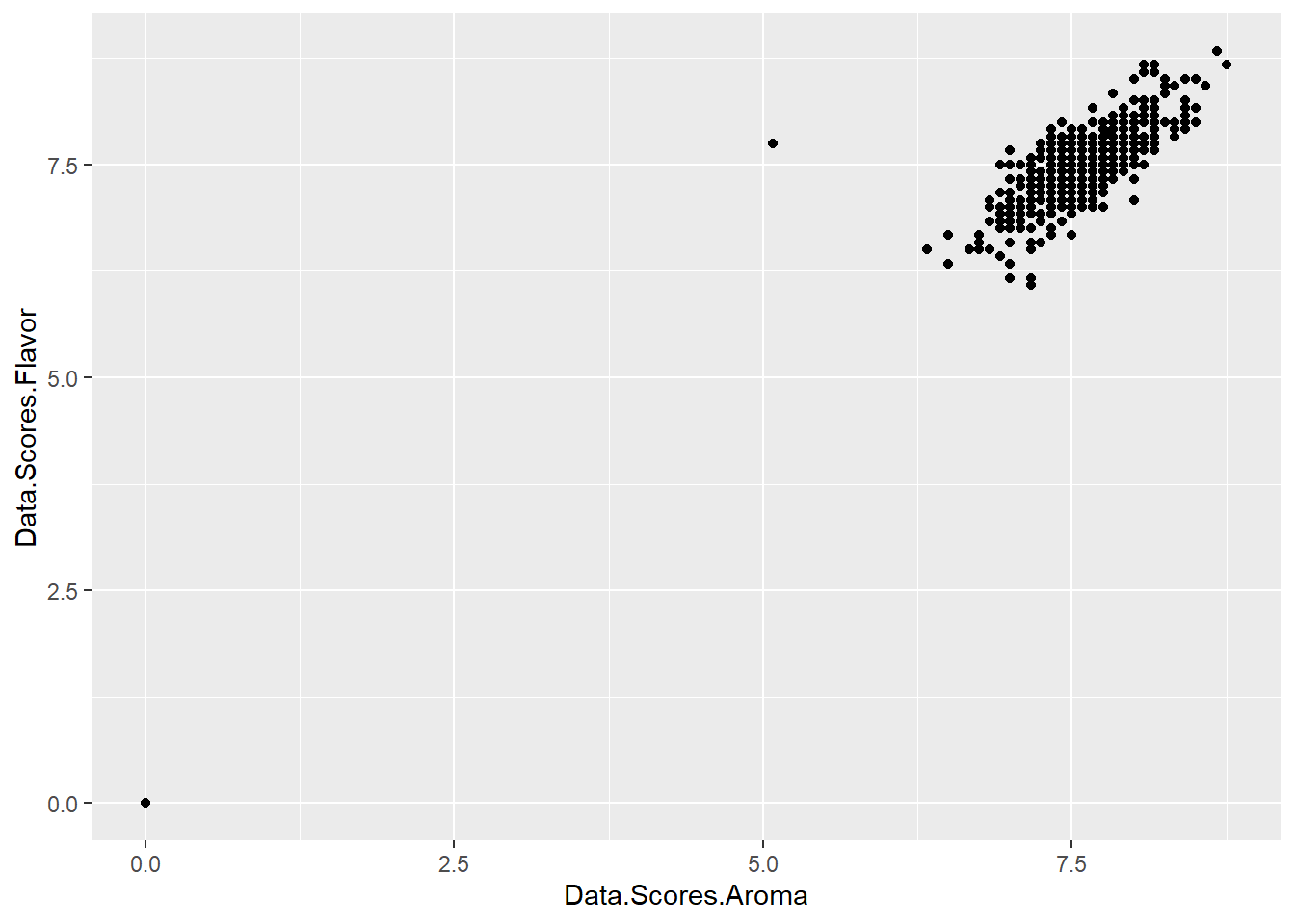
There appears to be a linear relationship between these two variables. As aroma increases, so too, does the flavour of the coffee. However, we can tell more of a story here using the longitudinal nature of the data and the locations from where the coffee is sourced.
Additionally, we may want to remove the single point from our visual. We can do that by changing the limit the axes or removing that outlier. For now, we will simply change the limits of the plot.
First, let’s show this association over time by using the transition_time() argument associated with gganimate. We select the ‘Year” variable which is, in this dataset, the time indicator. We also use the labs() option to add a title (the year) and the ’linear’ option for a smooth transition between years. Note, this plot might take a short while to visualise.
ggplot(coffee, aes(x = Data.Scores.Aroma, y = Data.Scores.Flavor)) +
geom_point() +
  xlim(6.5, NA) +
  ylim(5, NA)+
  transition_time(Year) +
  ease_aes('linear') +
  labs(title = 'Year: {frame_time}')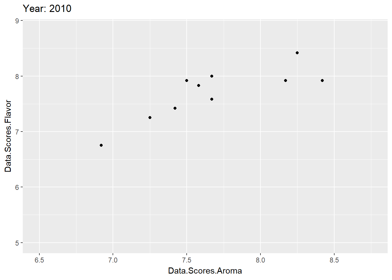
What does this plot tell you?
Next, we may wish to demonstrate if the observed relationship between aroma and flavour is the same across locations. We have an indicator showing which country from which the coffee is sourced. Here, then, we don’t have a ‘time’ variable, but our third variable of interest is the location. This is a categorical variable indicating which country the coffee is sourced from. Thus, we use the transition_states() argument and set it to the ‘Location.Country’ variable. This provides a scatter plot that rotates through the points of each location.
ggplot(coffee, aes(x = Data.Scores.Aroma, y = Data.Scores.Flavor)) +
geom_point() +
  xlim(6.5, NA) +
  ylim(5, NA)+
  transition_states(Location.Country) +
  ease_aes('linear') +
  labs(title = 'Country: {closest_state}')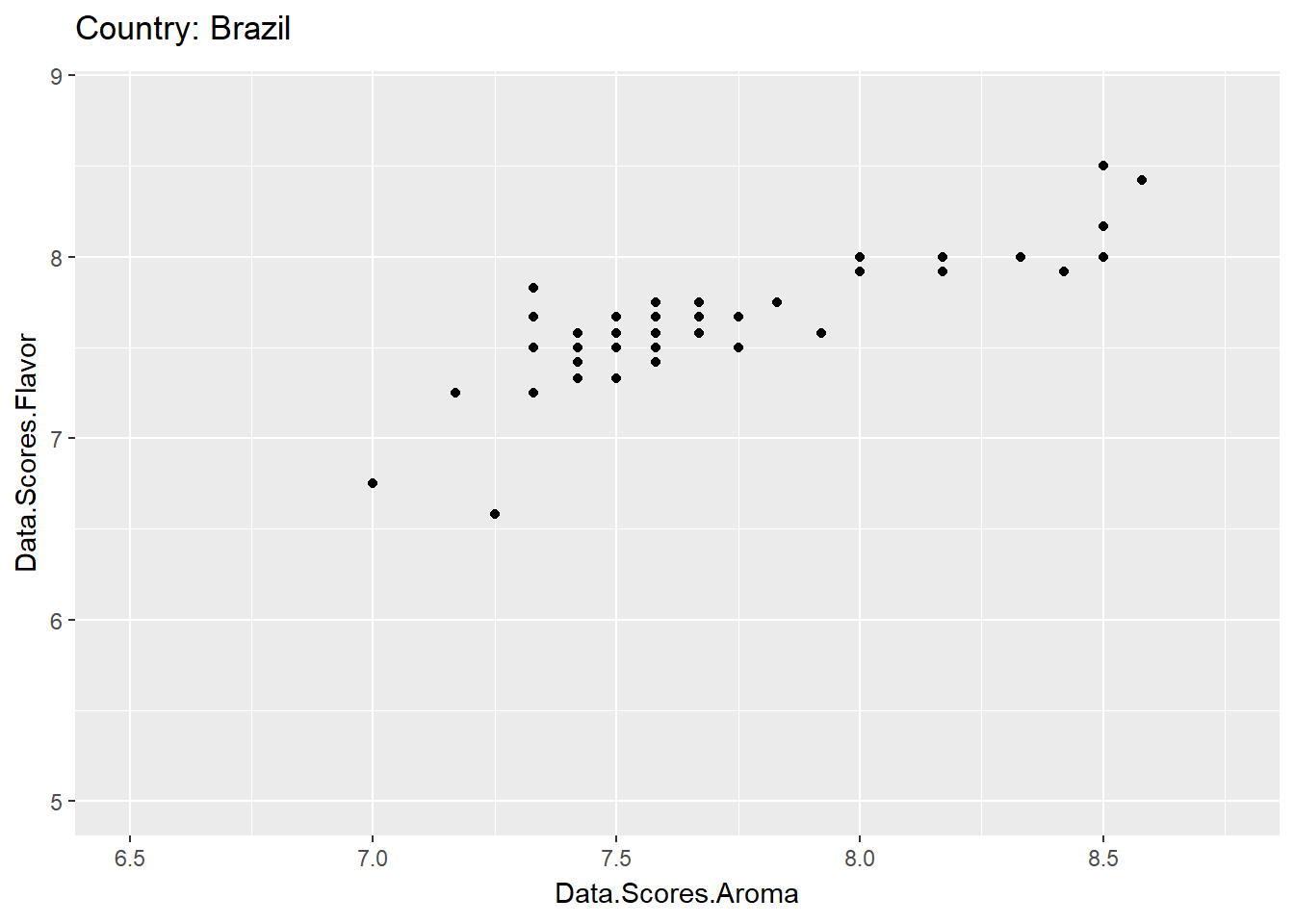
In order to save these use the anim_save() function and save them as a .gif so you can put it on a poster or website.
anim_save("Flavour_Aroma_Locations.gif")You may wish to combine some skills here. You may want to show the relationship over time across these locations. To do so, you can use the facet() option you have used before!
In this dataset, we have a lot of locations and so many facet windows - probably too many to visualise properly. So, I create a small subset of this dataset to pull a few locations and keep these focal variables.
coffee_small <- coffee %>%
  filter(Location.Country == c("Mexico", "Colombia")) %>%
  select(Location.Country, Year, Data.Scores.Aroma, Data.Scores.Flavor)
Now we can create our plot!
ggplot(coffee_small, aes(x = Data.Scores.Aroma, y = Data.Scores.Flavor)) +
geom_point() +
  xlim(6.5, NA) +
  ylim(5, NA)+
  facet_grid(~Location.Country) +
  transition_time(Year) +
  ease_aes('linear') +
labs(title = 'Year: {frame_time}') 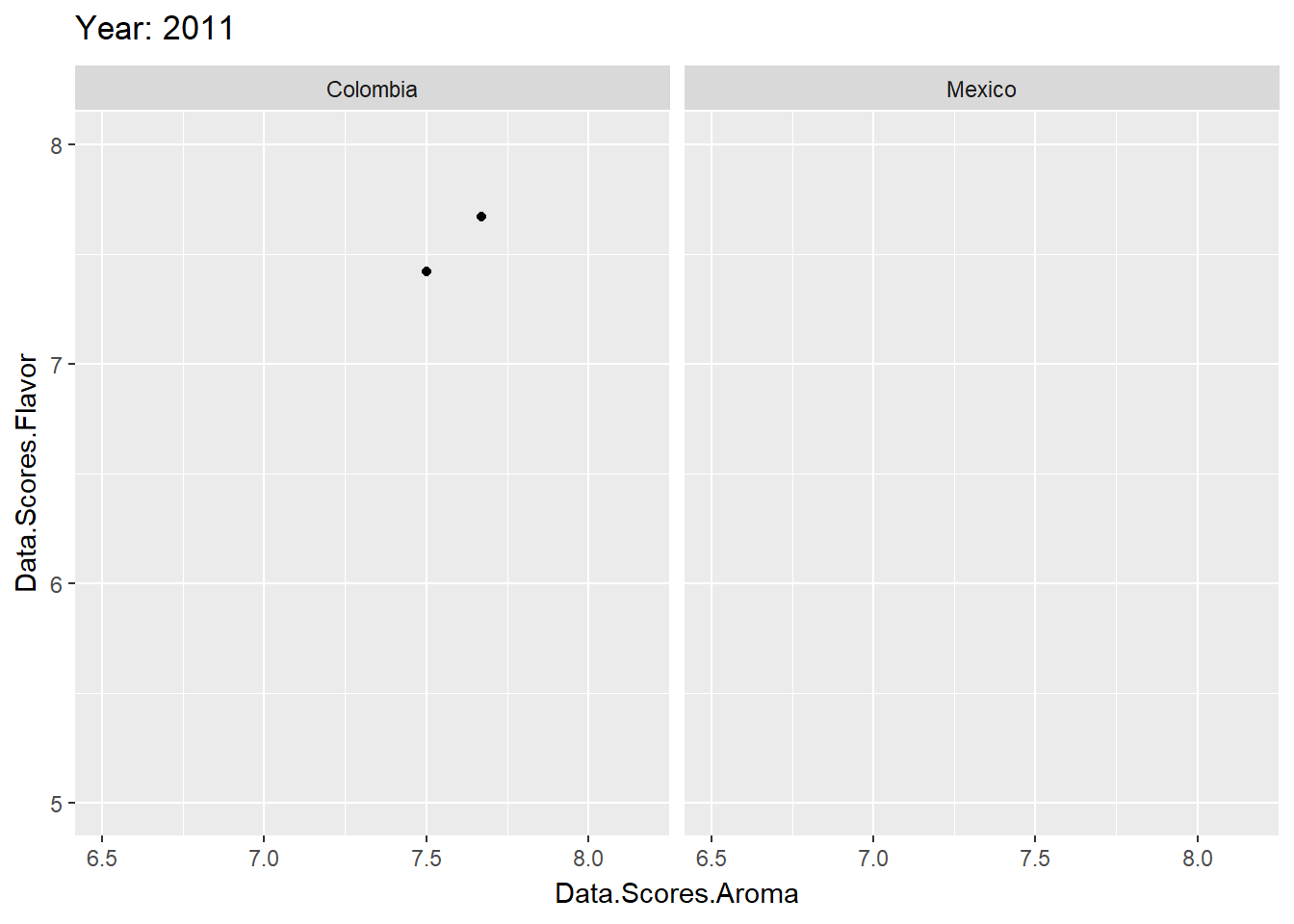
Notice that the plots move a little quickly? A little too quickly? There are a few ways to deal with this, the simplest is to use the animate function since its options are intuitive. To do this, you need to store the plot as an object. Then, using the nframes and fps options, we can reduce the speed. nframes is the total number of frames and fps is frames per second. Higher frames + lower fps = longer and smoother animation.
anim <- ggplot(coffee, aes(x = Data.Scores.Aroma, y = Data.Scores.Flavor)) +
  geom_point() +
  xlim(6.5, NA) +
  ylim(5, NA) +
  transition_states(Location.Country) +
  ease_aes('linear') +
  labs(title = 'Country: {closest_state}')
# Then run this!
animate(anim, nframes = 200, fps = 5)