library(ggsankey)
library(ggplot2)


df <- data.frame(
  person = 1:6,
  department = c("HR", "HR", "IT", "IT", "Finance", "Finance"),
  role = c("Manager", "Analyst", "Engineer", "Manager", "Analyst", "Manager")
)

df_long <- df %>%
make_long(department, role)11 Sankey Diagrams
11.1 Static Sankeys
You can create a static sankey diagram with an extension of ggplot2, the ggsankey diagram. Be sure to install new packages as we use them!
Here I create an example dataset designed to demonstrate the structure of the data used in sankey diagrams. The structure of the input data is key: each row represents an individual unit (in our example, a person) and the variables represent the stages or groupings that we want to connect. The make_long() function helps reshape the data into the special long format required by ggsankey.
The ggplot code is then built almost exactly like any other ggplot—by mapping aesthetics (x, node, next_node, etc.) and layering geoms (geom_sankey() for the flows and geom_sankey_label() for the node labels).
ggplot(df_long, aes(x = x,
                    next_x = next_x,
                    node = node,
                    next_node = next_node,
                    fill = node,
                    label = node)) +
  geom_sankey(flow.alpha = 0.6, node.color = "gray30") +
  geom_sankey_label(size = 3, color = "white") +
  theme_sankey(base_size = 16) +
  labs(title = "Departments connected to roles", x = "", fill = "Node")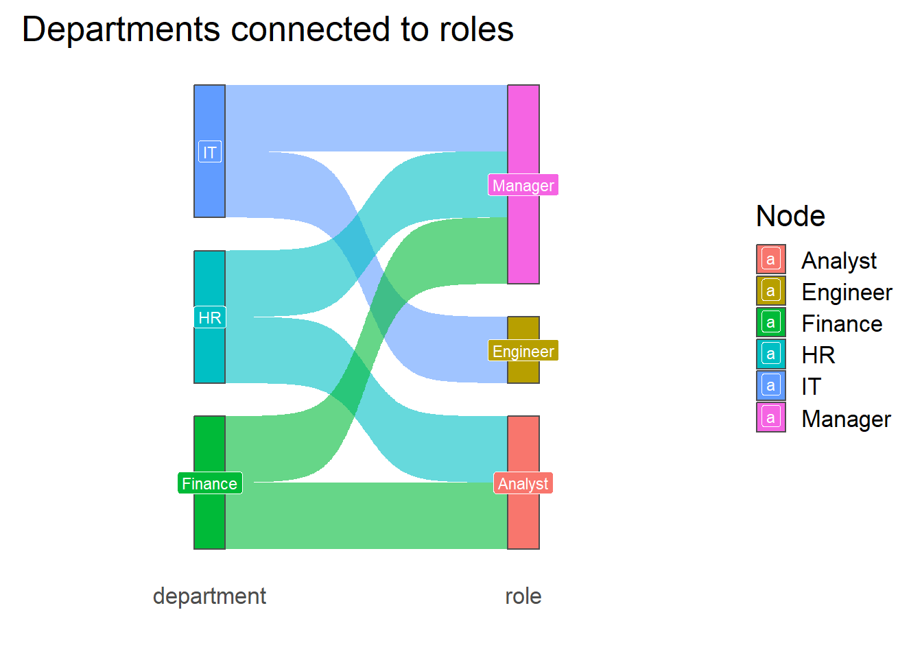
To summarize, static Sankey diagrams are a powerful way to represent how individuals, resources, or events “flow” between categories.
Static Sankey diagrams are especially useful when:
You want to highlight categorical transitions (e.g., departments → roles, courses → majors, or stages in a process).
The dataset is not too large or complex, so that the flows remain legible.
You need a clean, publication-ready plot that integrates well with other ggplot2 visualizations.
In the next section, we’ll look at interactive Sankey diagrams, which allow users to hover, highlight, and explore more complex flows dynamically.
11.2 Dynamic Sankeys
library(networkD3)
library(tidyverse)
── Attaching core tidyverse packages ──────────────────────── tidyverse 2.0.0 ──
✔ dplyr 1.1.4 ✔ readr 2.1.5
✔ forcats 1.0.0 ✔ stringr 1.5.1
✔ lubridate 1.9.3 ✔ tibble 3.2.1
✔ purrr 1.0.2 ✔ tidyr 1.3.1
── Conflicts ────────────────────────────────────────── tidyverse_conflicts() ──
✖ dplyr::filter() masks stats::filter()
✖ dplyr::lag() masks stats::lag()
ℹ Use the conflicted package (<http://conflicted.r-lib.org/>) to force all conflicts to become errorsWhile static Sankey diagrams are great for clear, publication-ready visuals, sometimes it’s useful to let your audience explore the flows interactively. The networkD3 package provides a way to build dynamic Sankey diagrams directly in R that you can click, drag, and hover over to reveal more detail.
In the example below, we extend our dataset by adding a third dimension: location. Now, instead of just seeing how departments map to roles, we can also track how those roles are distributed across locations (NY or SF).
After preparing the nodes (unique categories across all stages) and links (pairs of connected categories with values that represent their flow), we can pass them into sankeyNetwork().
df <- data.frame(
  person = 1:6,
  department = c("HR", "HR", "IT", "IT", "Finance", "Finance"),
  role = c("Manager", "Analyst", "Engineer", "Manager", "Analyst", "Manager"),
  location = c("NY", "NY", "SF", "NY", "SF", "SF")
)


all_nodes <- unique(c(df$department, df$role, df$location))
nodes <- data.frame(name = all_nodes)


links_1 <- df %>%
  group_by(department, role) %>%
  summarise(value = n(), .groups = "drop") %>%
  mutate(
    source = match(department, nodes$name) - 1,
    target = match(role, nodes$name) - 1
  ) %>%
  select(source, target, value)


links_2 <- df %>%
  group_by(role, location) %>%
  summarise(value = n(), .groups = "drop") %>%
  mutate(
    source = match(role, nodes$name) - 1,
    target = match(location, nodes$name) - 1
  ) %>%
  select(source, target, value)


links <- bind_rows(links_1, links_2)

sankeyNetwork(
  Links = links,
  Nodes = nodes,
  Source = "source",
  Target = "target",
  Value = "value",
  NodeID = "name",
  fontSize = 12,
  nodeWidth = 30
)
Links is a tbl_df. Converting to a plain data frame.The resulting diagram has several advantages over a static plot:
Interactivity: You can hover over flows to highlight connections and see the underlying values
Drag-and-drop nodes: Rearrange nodes to explore different layouts and better understand relationships.
Scalability: Dynamic Sankeys handle more complex networks that would be difficult to interpret in a static image.
This makes networkd3 particularly useful when presenting data to an audience that wants to interact with the flows, or when working with more complicated structures that go beyond a simple two-level diagram.