library(ggplot2)
library(dplyr)
library(cowplot)7 Cleaning and Annotating
hybrid <- read.csv(file.choose())class_costs <- hybrid %>%
group_by(class) %>%
summarise(cost = mean(msrp, na.rm = TRUE)) %>%
ungroup()7.1 Titles
There are three things you need to learn about titles. First, how to alter them using the labs() option. Second, how to change their presentation (size etc.). Third, the substantive utility of titles on graphs.
Bellow I demonstrate code using a moderated version of the hybrid cars dataset. I present two versions of the graph to demosntrate differences in substance. You may wish to have descriptive titles that describe what the chart shows. Or you may wish to have narrative-based titles that describe what the chart shows.
Descriptive Title:
ggplot(class_costs, aes(x = class, y = cost)) +
  geom_bar(stat = "identity", fill = "steelblue") +
  labs(title = "Average Price by Car Class", x = "Car Class", y = "Average Cost") +
  theme_minimal() +
  theme(plot.title = element_text(size = 18, face = "bold"),
    axis.title.x = element_text(size = 14),
    axis.title.y = element_text(size = 14),
    axis.text = element_text(size = 12))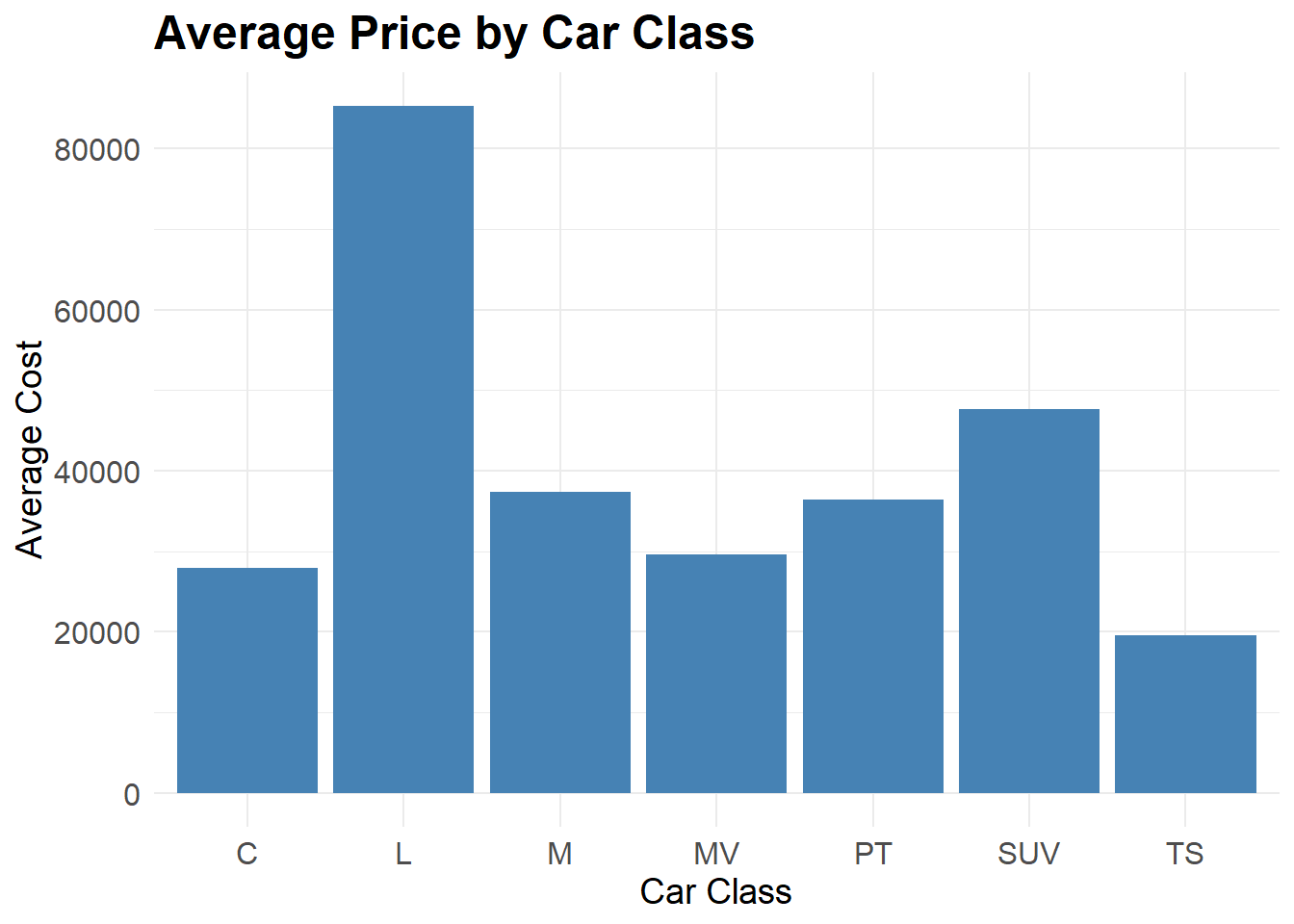
Narrative Title:
ggplot(class_costs, aes(x = class, y = cost)) +
  geom_bar(stat = "identity", fill = "steelblue") +
  labs(title = "Luxury Hybrids are Most Expensive", x = "Car Class", y = "Average Cost") +
  theme_minimal() +
  theme(plot.title = element_text(size = 18, face = "bold"),
    axis.title.x = element_text(size = 14),
    axis.title.y = element_text(size = 14),
    axis.text = element_text(size = 12))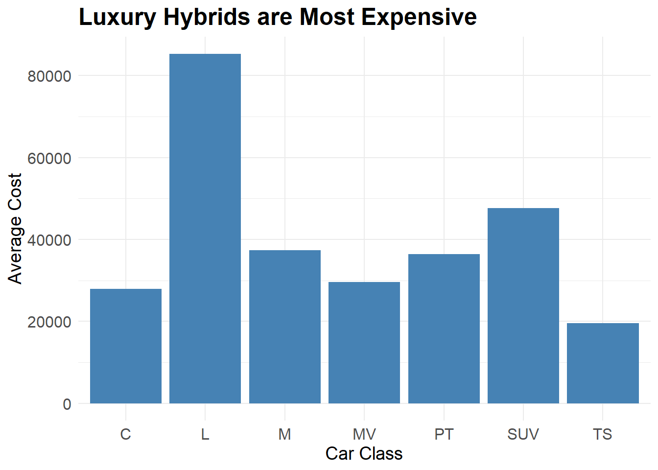
7.2 Axes
7.2.1 Swapping Axes
You might consider swapping the axes of your chart. This means that the content on the X axis (generally considered the independent variable) is swapped with the Y axis. This is a little trick that can improve the readership of your plot. Consider a bar chart. The wider it gets the harder it is to really see what Y value the X category has at the far side. Looking at a char from right to left is a little less intuitive and, without a ruler, hard to see what is doing on. Meanwhile, top to bottom can be a little easier.
Let’s repeat our last bar chart and flip it using the coord_flip() option of ggplot. See what you think.
ggplot(class_costs, aes(x = class, y = cost)) +
  geom_bar(stat = "identity", fill = "steelblue") +
  labs(title = "Luxury Hybrids are Most Expensive", x = "Car Class", y = "Average Cost") +
  theme_minimal() +
  theme(plot.title = element_text(size = 18, face = "bold"),
    axis.title.x = element_text(size = 14),
    axis.title.y = element_text(size = 14),
    axis.text = element_text(size = 12)) +
  coord_flip()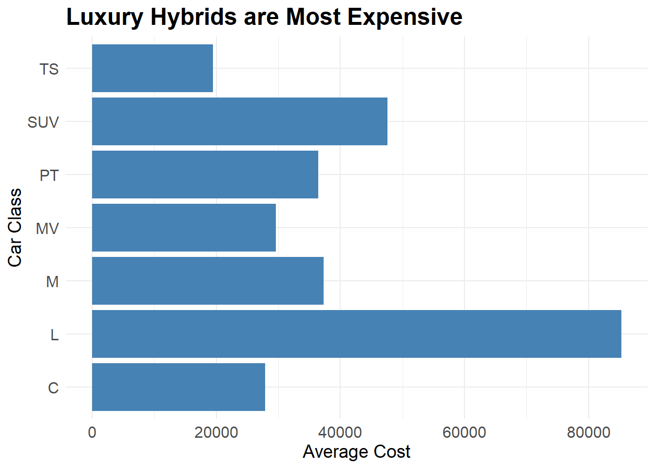
7.2.2 Changing order of Bar Chart Items
Changing the order of categories in a chart can be a good way to clearly visualise your data. Consider the bar chart above. If might look a little neater to change the orders.
Inside the aes() builder, use the reorder() option. You place x = reorder(x variable, y variable), which will arrange your X axis in ascending or descending order. Take a look at the following two chunks.
ggplot(class_costs, aes(x = reorder(class, -cost), y = cost)) +
  geom_bar(stat = "identity", fill = "steelblue") +
  labs(title = "Luxury Hybrids are Most Expensive",
       x = "Car Class",
       y = "Average Cost") +
  theme_minimal() +
  theme(
    plot.title = element_text(size = 18, face = "bold"),
    axis.title.x = element_text(size = 14),
    axis.title.y = element_text(size = 14),
    axis.text = element_text(size = 12)) +
  coord_flip()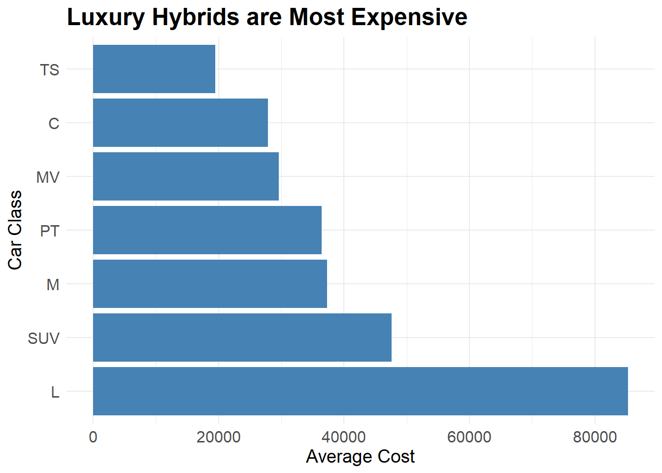
ggplot(class_costs, aes(x = reorder(class, +cost), y = cost)) +
  geom_bar(stat = "identity", fill = "steelblue") +
  labs(title = "Luxury Hybrids are Most Expensive",
       x = "Car Class",
       y = "Average Cost") +
  theme_minimal() +
  theme(
    plot.title = element_text(size = 18, face = "bold"),
    axis.title.x = element_text(size = 14),
    axis.title.y = element_text(size = 14),
    axis.text = element_text(size = 12)) +
  coord_flip()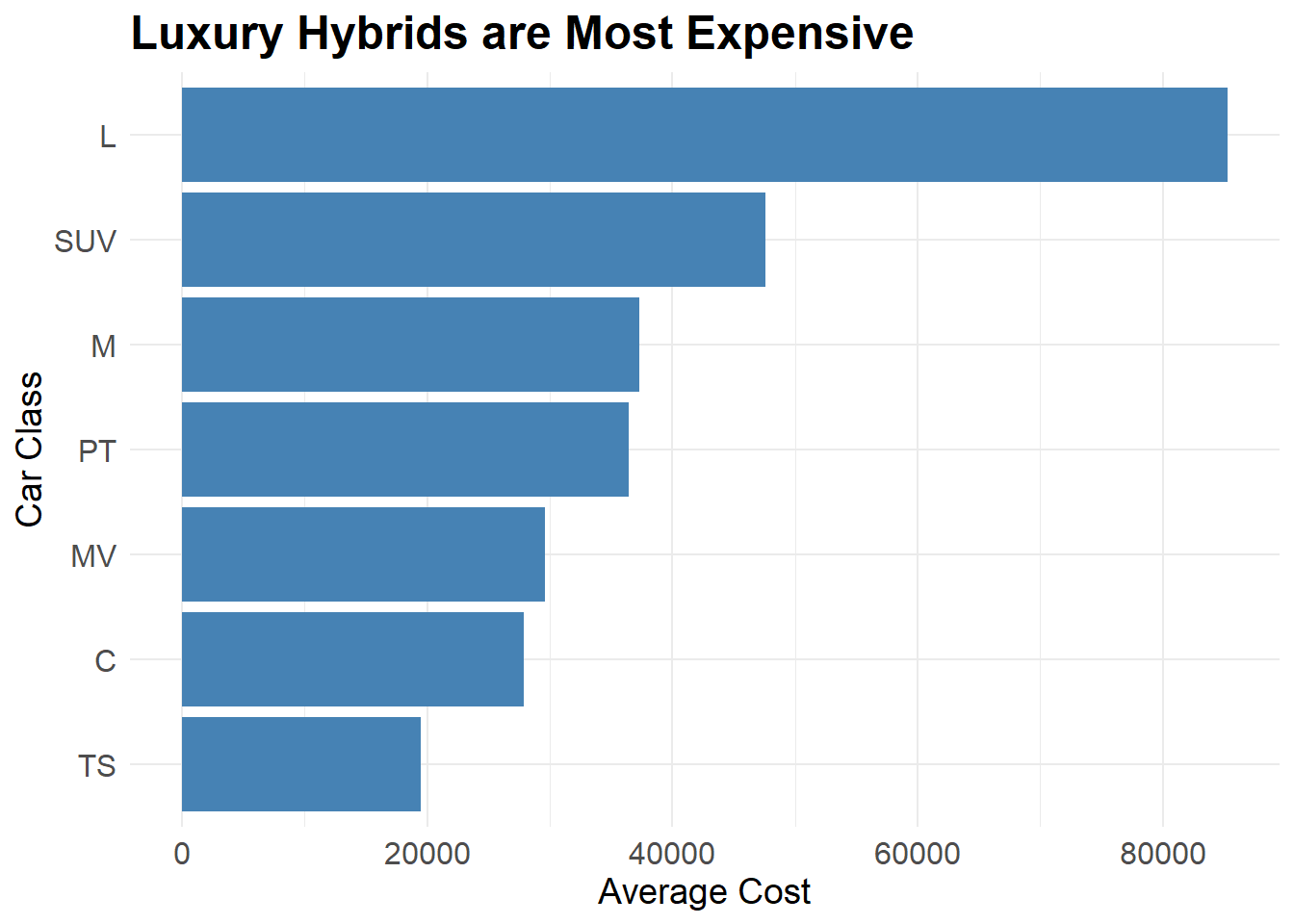
You can also change and customise the order you want.
ggplot(class_costs, aes(x = class, y = cost)) +
  geom_bar(stat = "identity", fill = "steelblue") +
  labs(title = "Luxury Hybrids are Most Expensive",
       x = "Car Class",
       y = "Average Cost") +
  theme_minimal() +
  theme(
    plot.title = element_text(size = 18, face = "bold"),
    axis.title.x = element_text(size = 14),
    axis.title.y = element_text(size = 14),
    axis.text = element_text(size = 12)) +
  coord_flip() +
  scale_x_discrete(limits = c("TS", "MV", "M", "L", "SUV", "PT", "C"))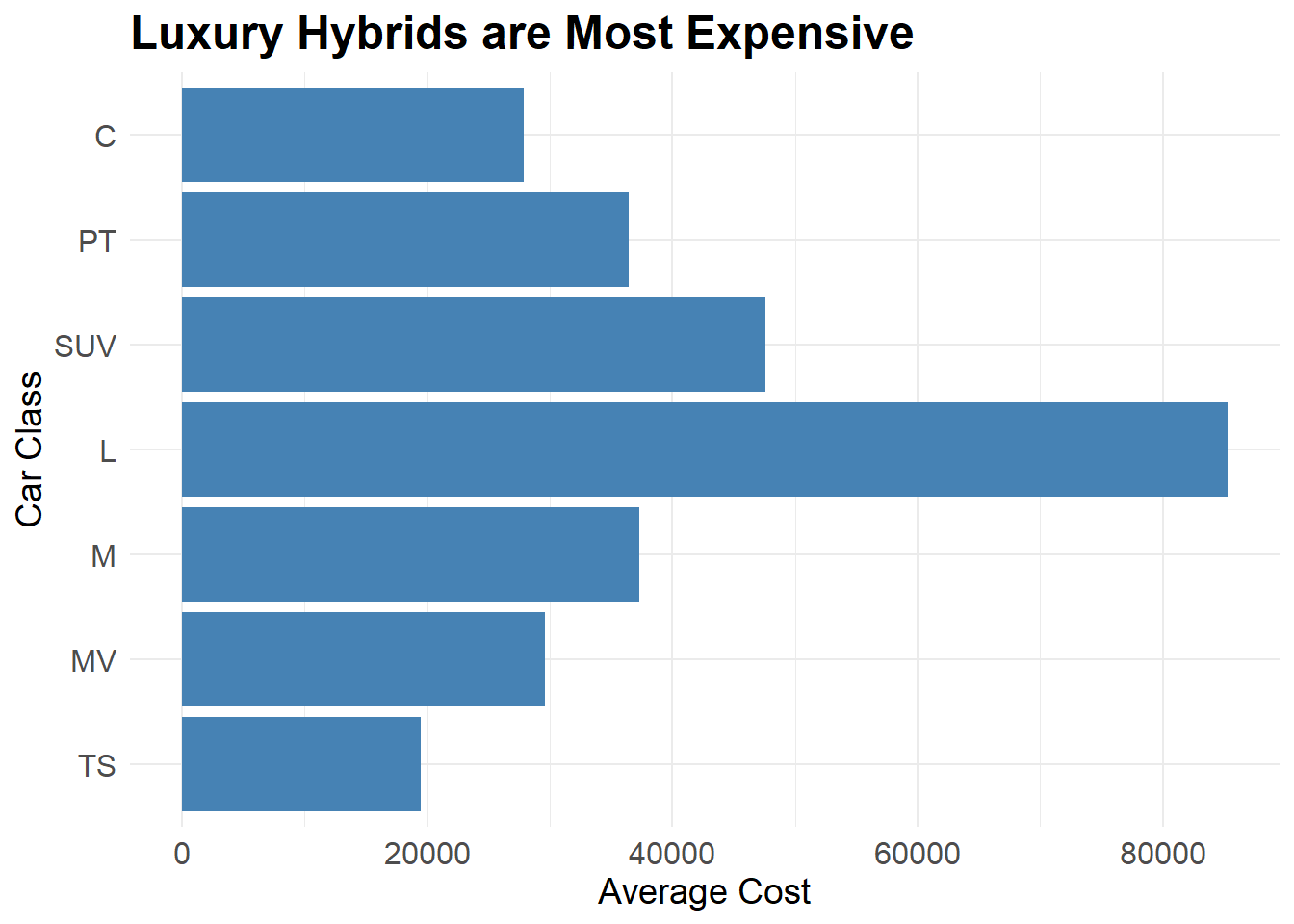
7.3 Annotations on Graphs
There are many different annotations you may wish to include in your graph. The aims of annotations are to highlight elements of the graph or to clarify something about the graph. Many of this comes from Chapter 7 of Chang’s book.
When creating a bar graph the code is slightly different. Since the x axis is categorical, the coordinates for your annotation need to reflect that. Instead of the number value of the annotation, you need to tell the ggplot which category you want the annotation over. Here, I place an arrow and some text onto the graph to demonstrate both the geom_text() and annotate() arguments.
ggplot(class_costs, aes(x = class, y = cost)) +
  geom_bar(stat = "identity", fill = "steelblue") +
  labs(title = "Luxury Hybrids are Most Expensive", x = "Car Class", y = "Average Cost") +
  theme_minimal() +
  theme(plot.title = element_text(size = 18, face = "bold"),
    axis.title.x = element_text(size = 14),
    axis.title.y = element_text(size = 14),
    axis.text = element_text(size = 12)) +
  geom_text(x = "TS", y = 70000, aes(label = "Cheapest")) +
annotate("segment", x = "TS", xend = "TS", y = 60000, yend = 20000, arrow = arrow(angle = 45, length = unit(.2,"cm"))) 
There are some other ways that you can highlight elements of your plot. For example, you could shade a specific area of your plot or add other annotations to highlight aspects of your visualisation.
costs_time <- hybrid %>%
  group_by(year) %>%
  summarise(avg_cost = mean(msrp, na.rm = TRUE)) %>%
ungroup()ggplot(costs_time, aes(x = year, y = avg_cost)) +
geom_line(color = "black") +
annotate("rect", xmin = 2005, xmax = 2007, ymin =27500, ymax = 47000, alpha = 0.1, fill = "red")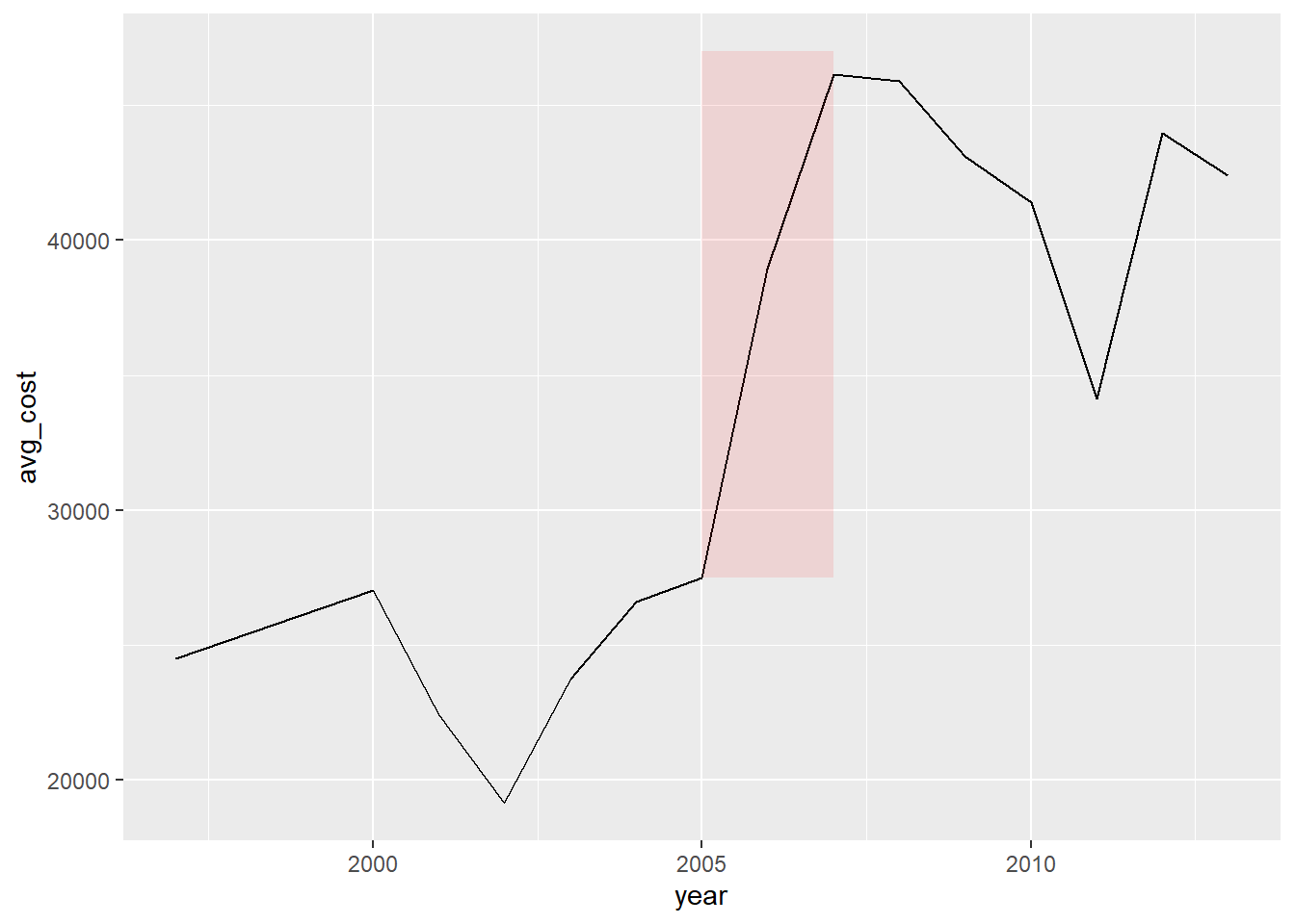
7.4 Colours
Colours are used to draw attention and highlight aspects of visualisations. You could change the fill of boxes, the lines or dots of a plot. Throughout the course so far you have seen example of this using various options of color or fill. Here, let’s discuss accessible colours best used for contrast in visualisations both in the theme of the plot and in the plot itself. In general, the higher contrast colours are best. In concert with that, however, is the fact that some colour pairs are less colour-blind friendly than others. For example, green and red is one of the most common forms of colour blindness yet we use it so much! Think traffic lights, general images with green meaning go and red stop.
One thing to consider is a dark/light contrast from background to foreground. You can use the theme options to do this. Look at the following examples and see what you think.
ggplot(costs_time, aes(x = year, y = avg_cost)) +
geom_line(color = "white") +
annotate("rect", xmin = 2005, xmax = 2007, ymin =27500, ymax = 47000, alpha = 0.3, fill = "red") +
theme_dark()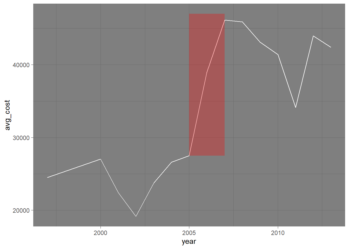
ggplot(costs_time, aes(x = year, y = avg_cost)) +
  geom_line(color = "black") +
annotate("rect", xmin = 2005, xmax = 2007, ymin =27500, ymax = 47000, alpha = 0.1, fill = "red") +
theme_light()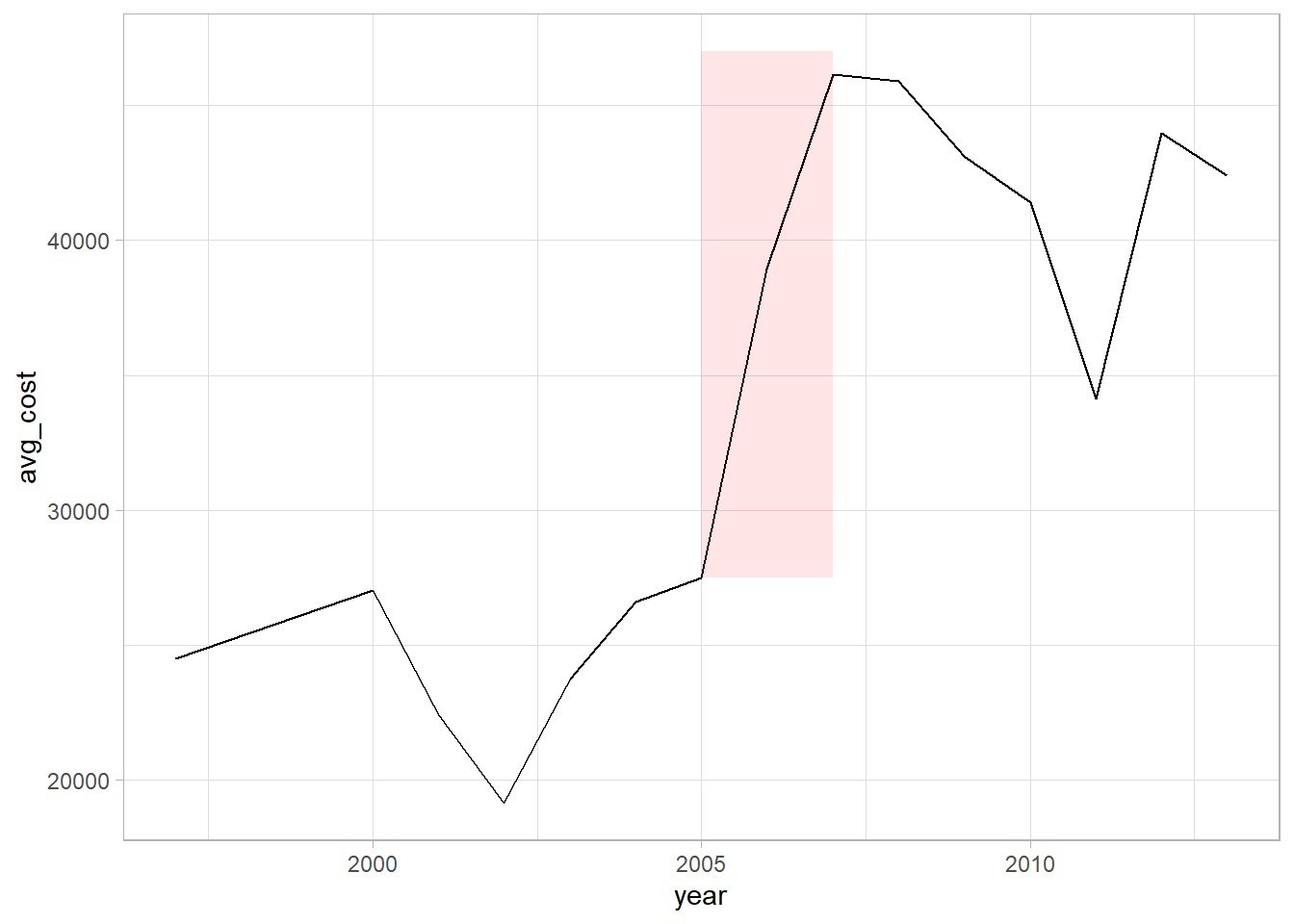
ggplot(costs_time, aes(x = year, y = avg_cost)) +
  geom_line(color = "black") +
  annotate("rect", xmin = 2005, xmax = 2007, ymin =27500, ymax = 47000, alpha = 0.1, fill = "red") +
  theme_bw()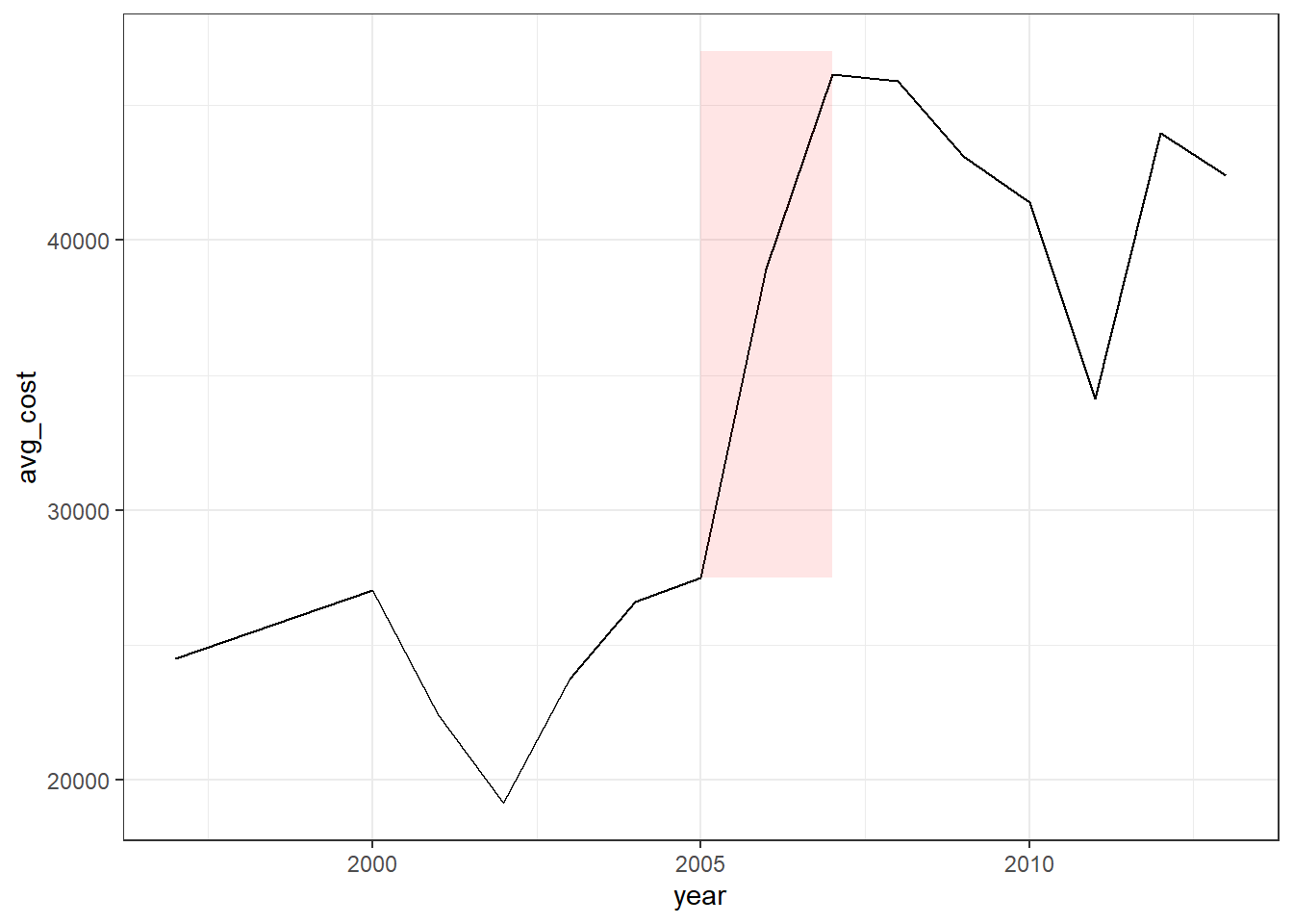
7.5 Multiple Plots
You might want to present multiple plots together. One option is to use the facet() option which is useful to split your plot out by various categories. Another option is to use the plot_grid() function from a package called cowplot. In order to use the plot_grid function, you first have to store your plots as objects. Follow the flow of code in the next chunk and see if you can determine each step.
# Making the objects
p1 <- ggplot(costs_time, aes(x = year, y = avg_cost)) +
  geom_line() +
  annotate("rect", xmin = 2005, xmax = 2007, ymin =27500, ymax = 47000, alpha = 0.1, fill = "red")

p2 <- ggplot(class_costs, aes(x = class, y = cost)) +
  geom_bar(stat = "identity", fill = "steelblue") +
  labs(title = "Luxury Hybrids are Most Expensive",
       x = "Car Class",
       y = "Average Cost") +
  theme_minimal() +
  theme(
    plot.title = element_text(size = 18, face = "bold"),
    axis.title.x = element_text(size = 14),
    axis.title.y = element_text(size = 14),
    axis.text = element_text(size = 12)) +
  coord_flip() +
  scale_x_discrete(limits = c("TS", "MV", "M", "L", "SUV", "PT", "C"))

p3 <- ggplot(class_costs, aes(x = class, y = cost)) +
  geom_bar(stat = "identity", fill = "steelblue") +
  labs(title = "Luxury Hybrids are Most Expensive", x = "Car Class", y = "Average Cost") +
  theme_minimal() +
  theme(plot.title = element_text(size = 18, face = "bold"),
    axis.title.x = element_text(size = 14),
    axis.title.y = element_text(size = 14),
    axis.text = element_text(size = 12)) +
  geom_text(x = "TS", y = 70000, aes(label = "Cheapest")) +
  annotate("segment", x = "TS", xend = "TS", y = 60000, yend = 20000, arrow = arrow(angle = 45, length = unit(.2,"cm")))
Now to create the plot_grid (which you can also make an object and even plot_grid from those!).
plot_grid(p1, p2, p3, labels = c("A", "B", "C"), ncol = 2)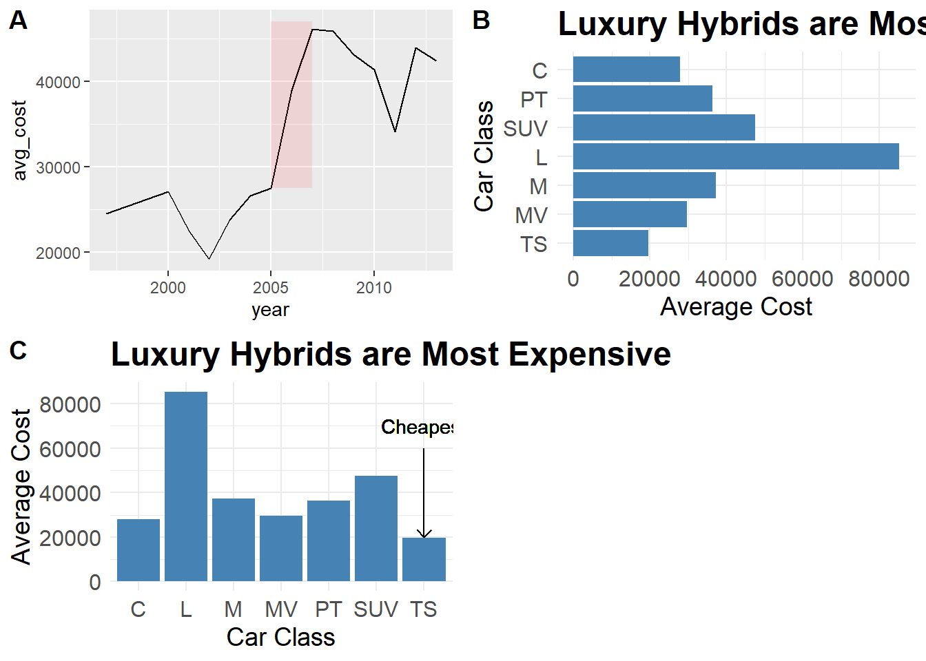
7.6 Activities
From Winston Chang’s R Graphics Cookbook:
7.8 annotating individual facets
8.2 Setting range of Axes
8.5 Setting Ratio of X/Y axes
8.6/8.9 tick labels
9.1 More on titles
9.2 Appearance of Text
Chapter 10 Legends
12.3/4 Colorblind Friendly Palettes